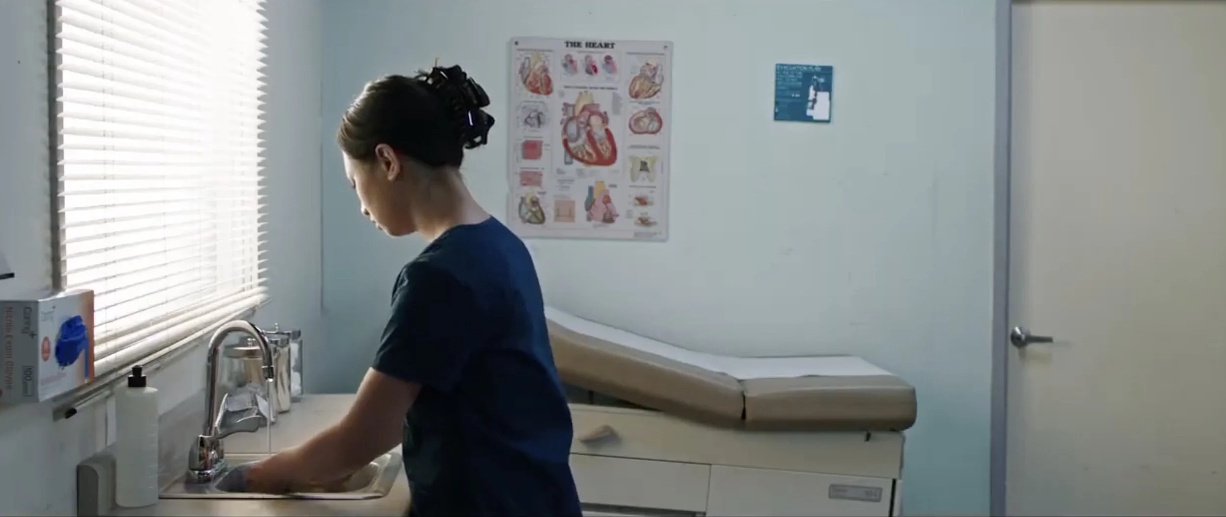
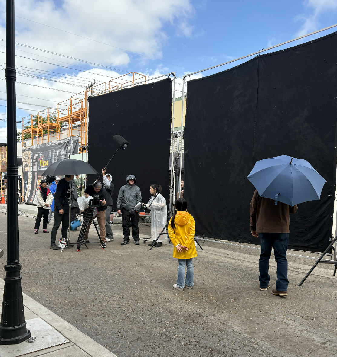
The Dance Between Us
It all begins with an idea.
Biola University — 15-Minute Short Film
Role: Production Designer
Project Overview
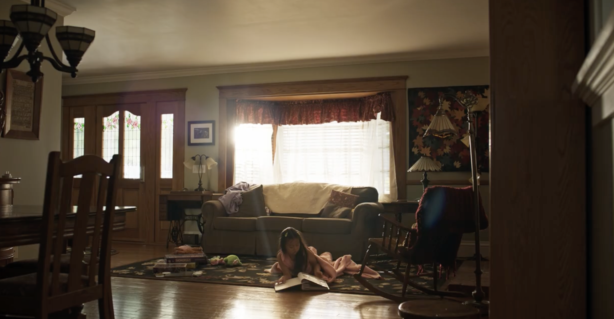
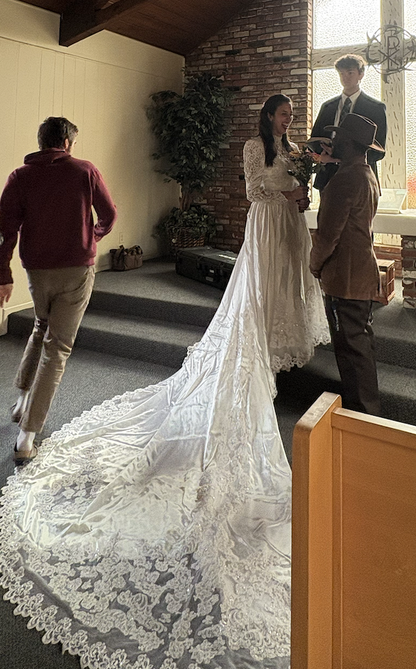
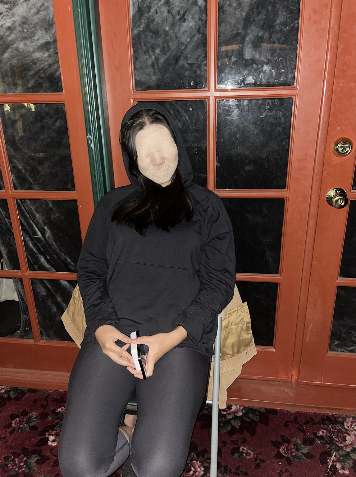
The Dance Between Us is a narrative short film produced through Biola University’s film program. The story explores generational trauma, memory, and healing through the eyes of a daughter navigating her complicated relationship with her father. As Production Designer, I shaped the visual world of the film across multiple timelines, ensuring that color, set details, and environmental textures grounded the emotional arc of the characters and clearly differentiated past and present.
Design Goals & Concept
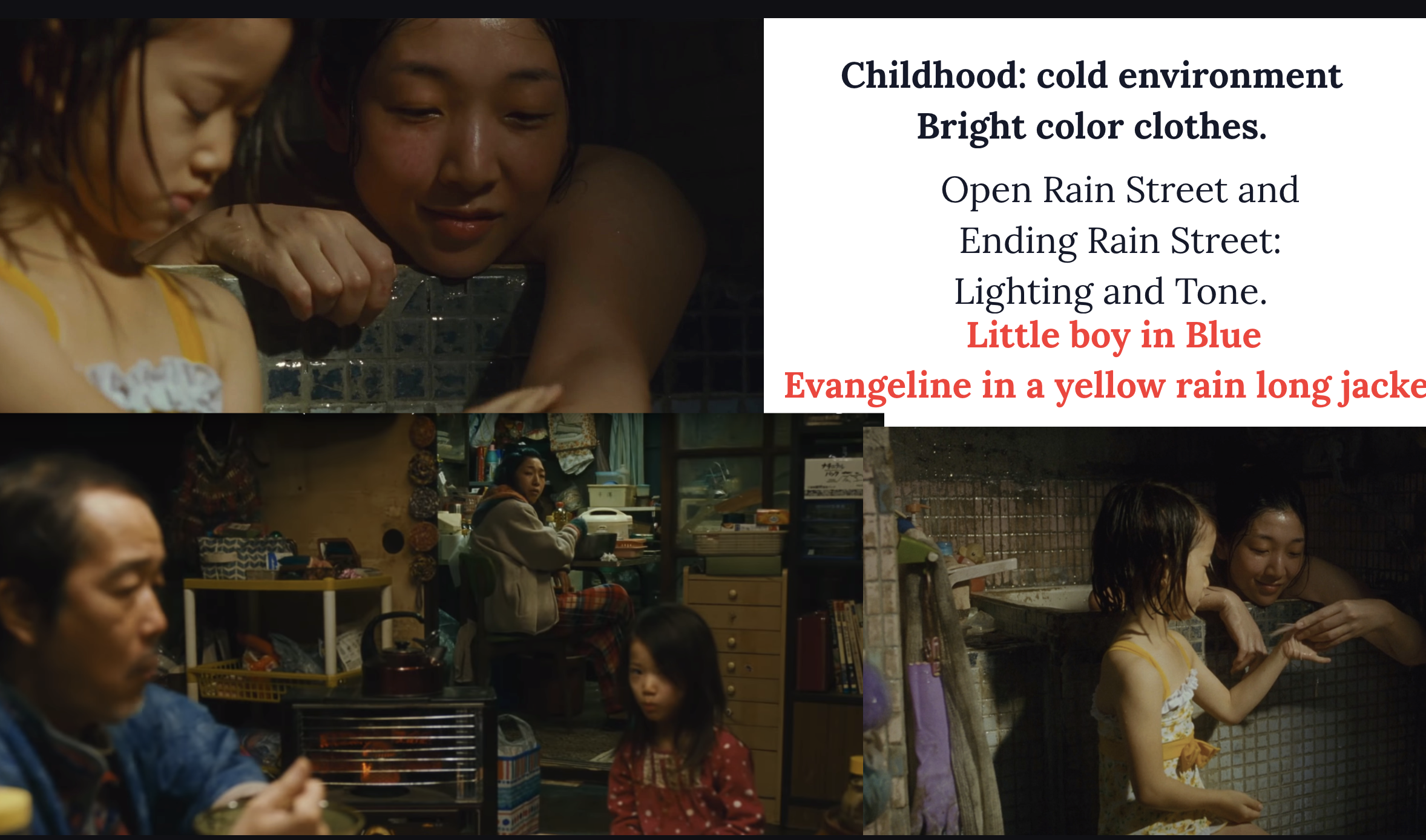
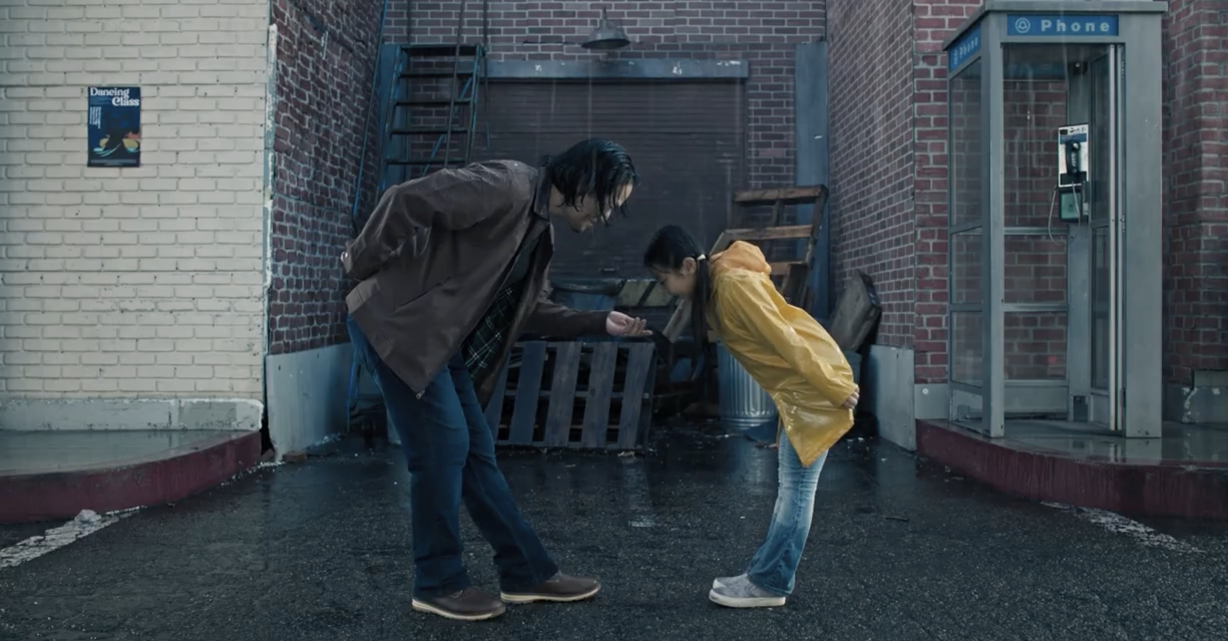
The visual design centered on creating a contrast between childhood nostalgia and the heaviness of unresolved trauma. Childhood scenes leaned into warm, worn-in textures and colorful, cluttered spaces, while adult sequences shifted toward minimalist, colder environments that reflect emotional distance.
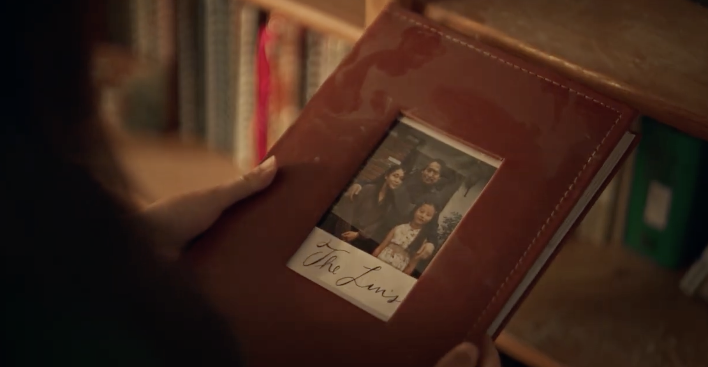
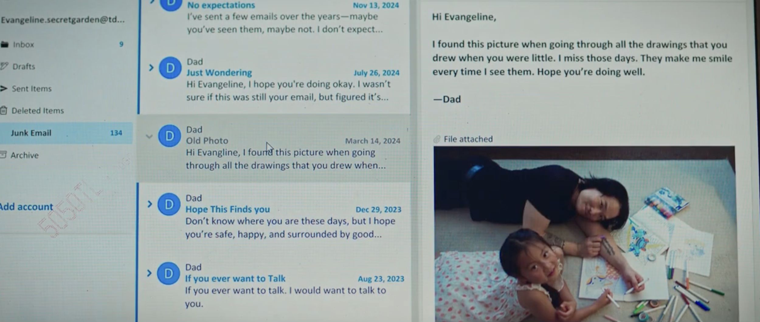
Rain, shoes, and domestic spaces function as repeating visual motifs throughout the story, so the design emphasized symbolic details—such as the old house’s faded heart drawing or the contrast between muddy childhood shoes and blood-spattered nursing shoes—to reinforce themes of memory and broken cycles.
My goal was to build environments that made emotional states feel tangible, allowing the audience to see internal conflict reflected in the physical world.
Responsibilities as Production Designer
As Production Designer for The Dance Between Us, I was responsible for:
Developing the film’s overall visual concept, tone, and color language
Designing and dressing sets across three timelines (childhood home, teenage years, present-day apartment and hospital environments)
Creating moodboards and visual references for the director and cinematographer
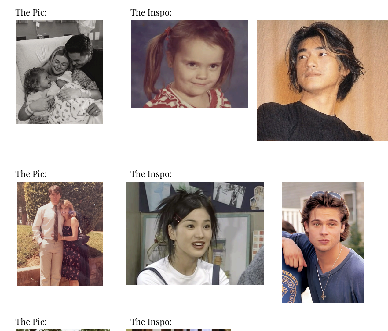
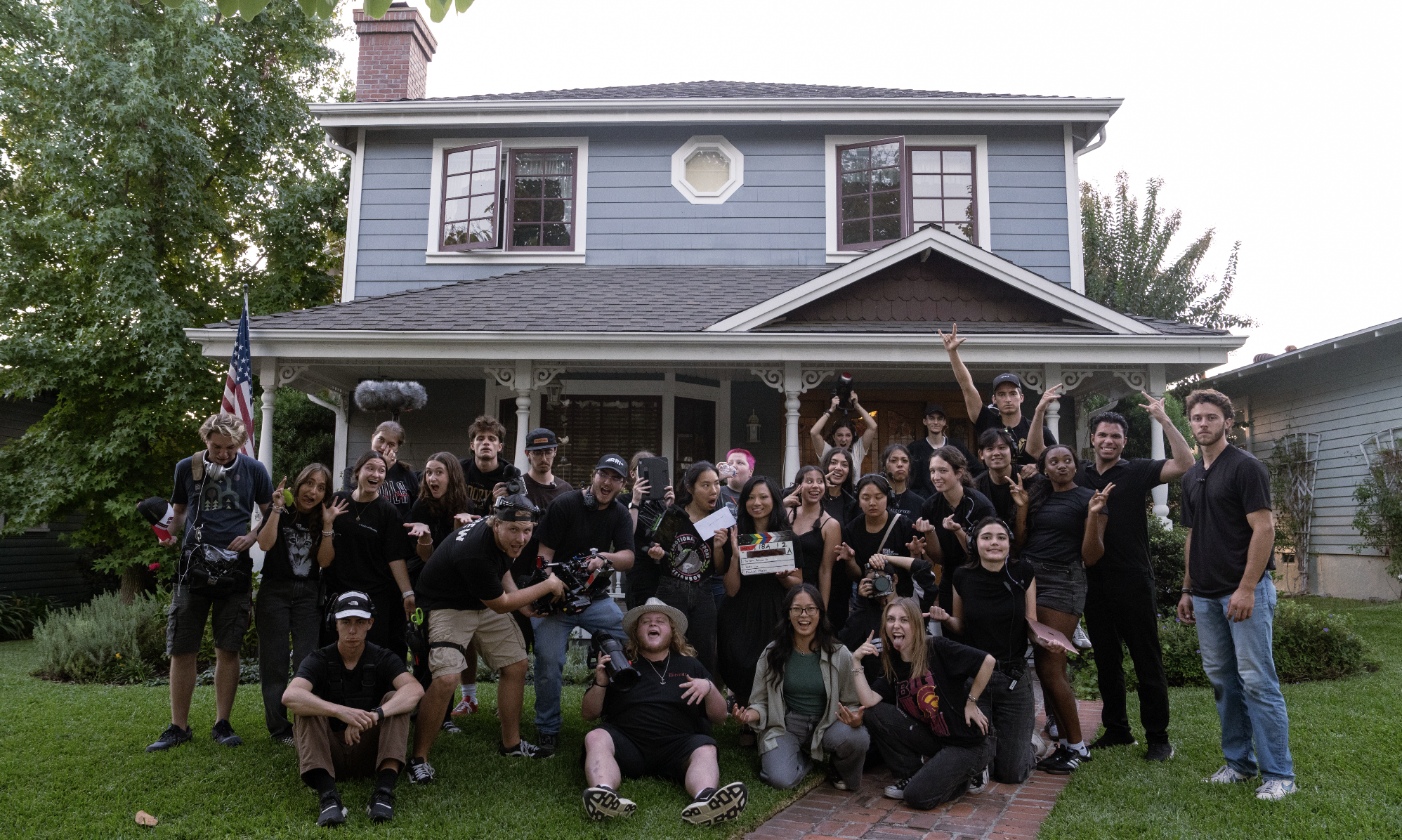
Selecting props with narrative significance (family album, umbrella, childhood drawings, yellow raincoat, shoes, letter)
Managing continuity of visual motifs across scenes (rain imagery, damage/wear, domestic items)
Styling and sourcing objects that showed aging over time (faded heart drawing, worn furniture, character belongings)
Coordinating with costume, hair, and makeup to maintain character consistency and emotional progression
Preparing spaces for both scripted scenes and emotional beats revealed through silence, memory, or flashback
Final Result
The final design created a cohesive visual journey across decades of the protagonist’s life, making emotional shifts readable through environment and detail. Each space—the cramped childhood home, the sparse adult apartment, and the sterile hospital—was crafted to echo the character’s internal struggle while visually supporting the film’s symbolic storytelling.
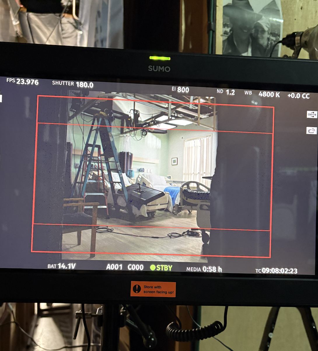
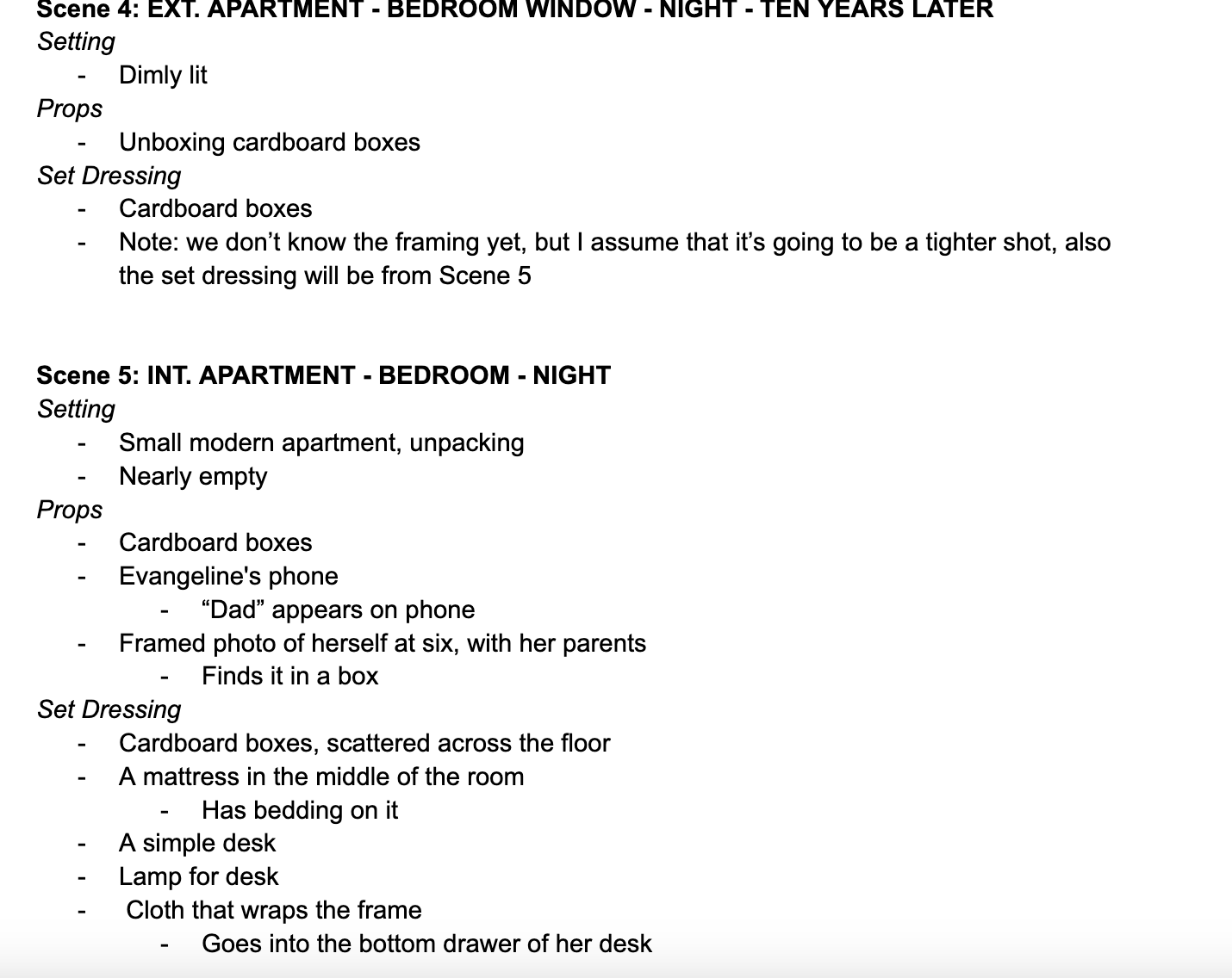
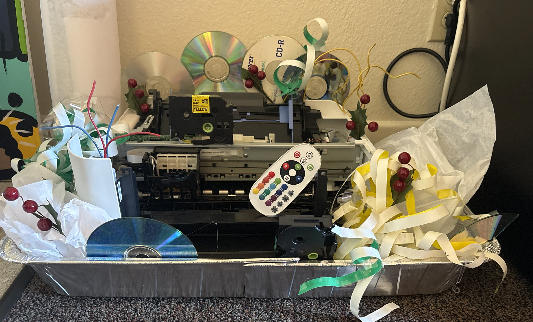
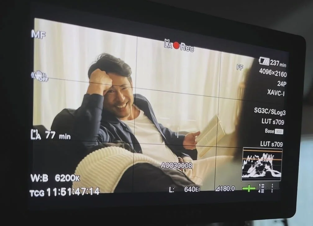
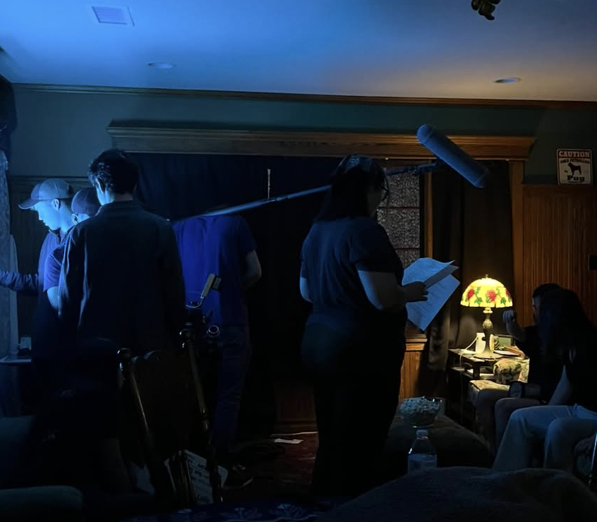
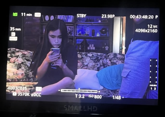
Below are production stills, behind-the-scenes images, moodboards, and concept materials documenting the film’s design process.
Live From Lot F
It all begins with an idea.
Biola University — 90-Minute Live Comedy Show
Role: Production Designer
Project Overview
Live from Lot F is a 90-minute live comedy show produced by Biola University CMA students. As Production Designer, I oversaw the entire visual presentation of the show, ensuring that every element on stage supported the comedic tone, pacing, and personality of the performers. My work focused on creating a cohesive aesthetic that elevated the live, sketch-driven format while maintaining efficient backstage workflows.
Design Goals & Concept
The visual direction for Live from Lot F centered on a playful, energetic atmosphere that matched the improvisational style of the show. I developed a design approach that balanced clean, functional elements with bold, comedic visuals. The goal was to create a stage environment that felt polished and professional, yet flexible enough to accommodate quick transitions between sketches. Color, prop choice, and costume textures were intentionally selected to read clearly on stage under live lighting and to support each character’s comedic identity.
Responsibilities as Production Designer
As Production Designer for the live show, I was responsible for:
Designing the overall visual concept and tone of the show
Sourcing, organizing, and managing all props
Designing and coordinating costumes for all sketches and performers
Overseeing hair and makeup direction to support character clarity and comedic style
Dressing the set to create a cohesive, animated stage environment
Ensuring efficient quick-changes and prop transitions backstage
Collaborating with the director, stage manager, and CMA student team to maintain visual continuity
Adapting designs for live performance needs, including mobility, timing, and sightlines
Final Result
The final production created a fun, engaging stage presence that supported each sketch and energized the live audience. Props, costumes, hair and makeup, and set dressing came together to build a cohesive comedic world that enhanced the performers’ timing and storytelling.
Below are production stills, behind-the-scenes photos, and design materials documenting the show’s visual development.
Ramona
It all begins with an idea.
Feature Film
Role: Costume Designer
Project Overview
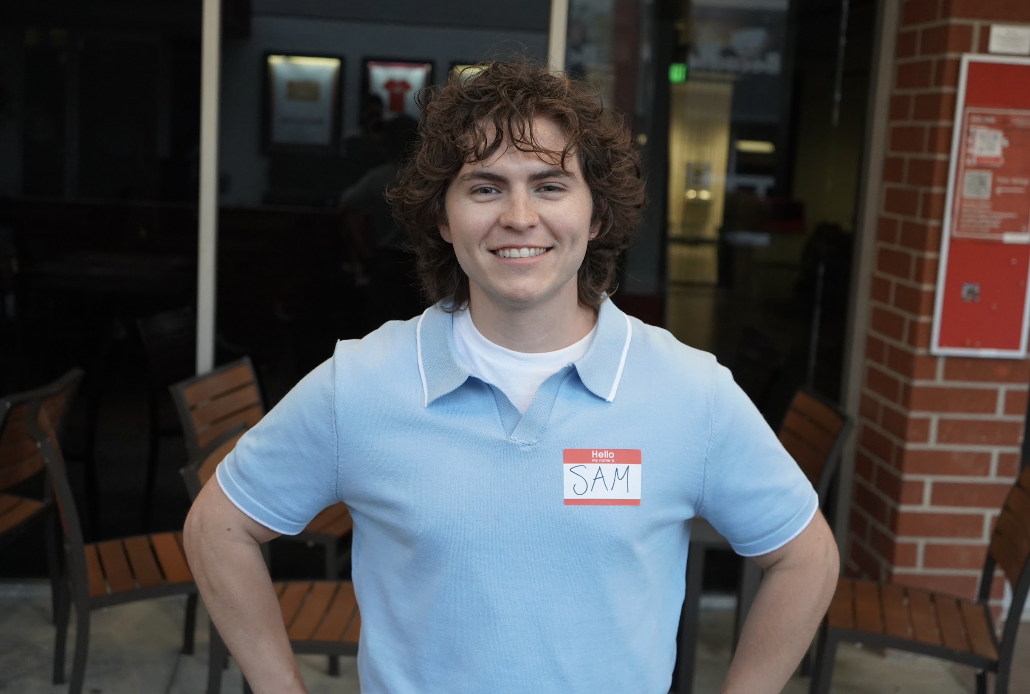
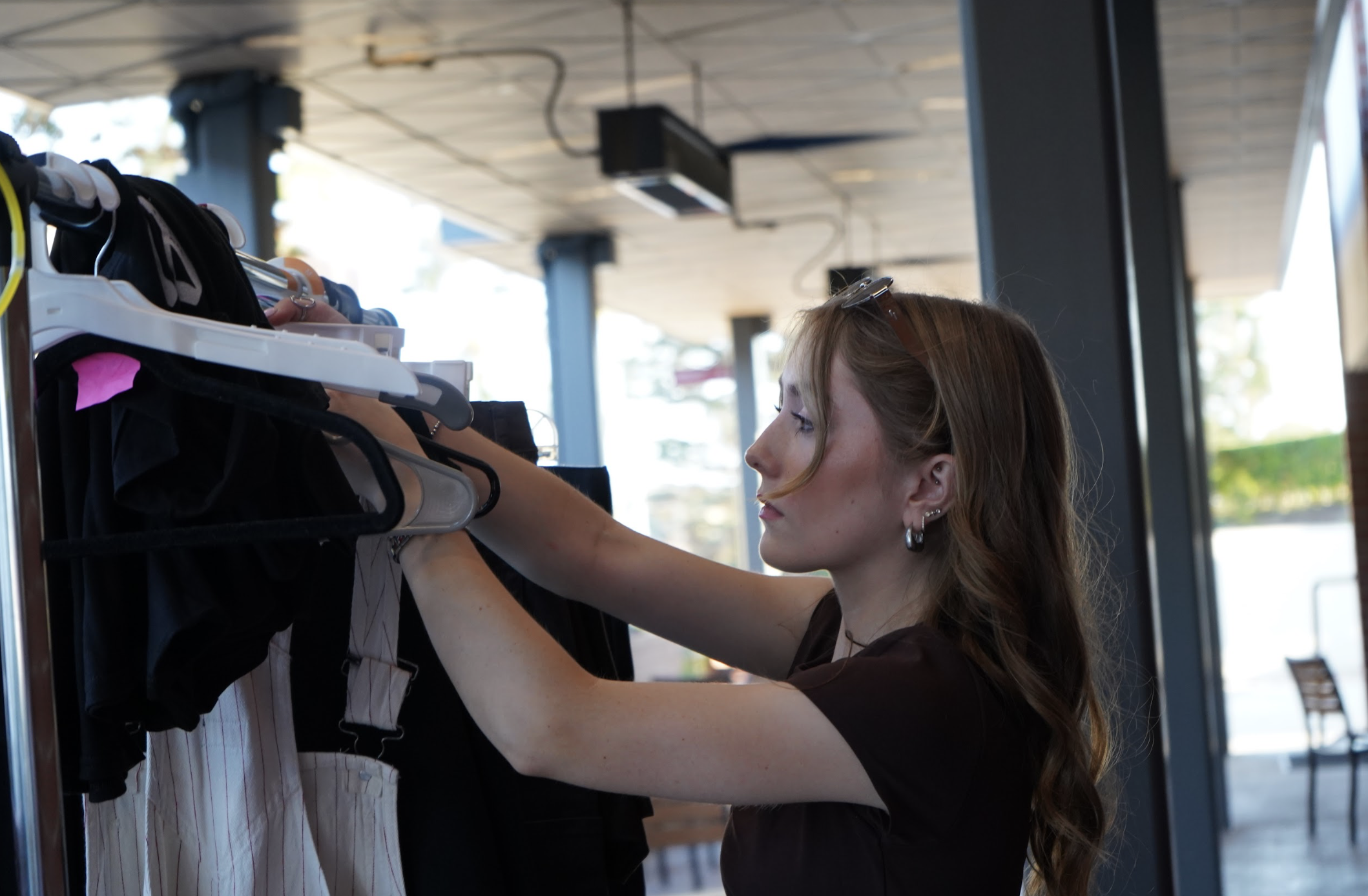
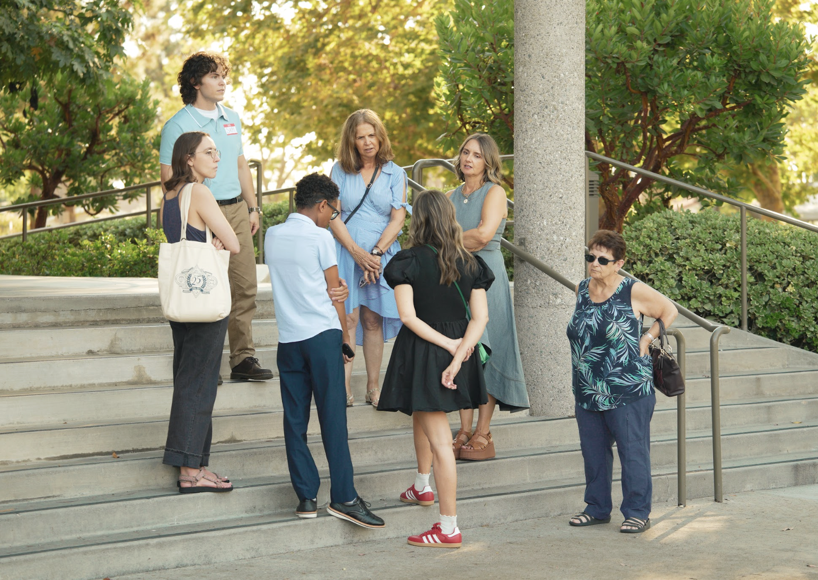
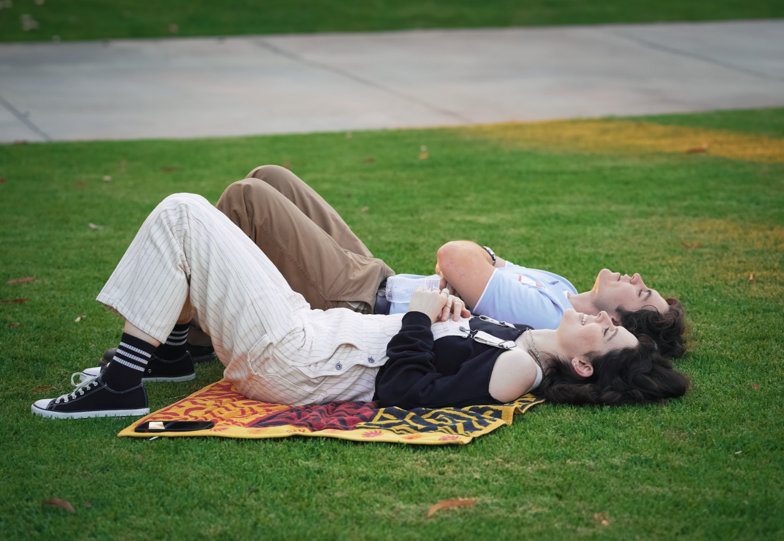
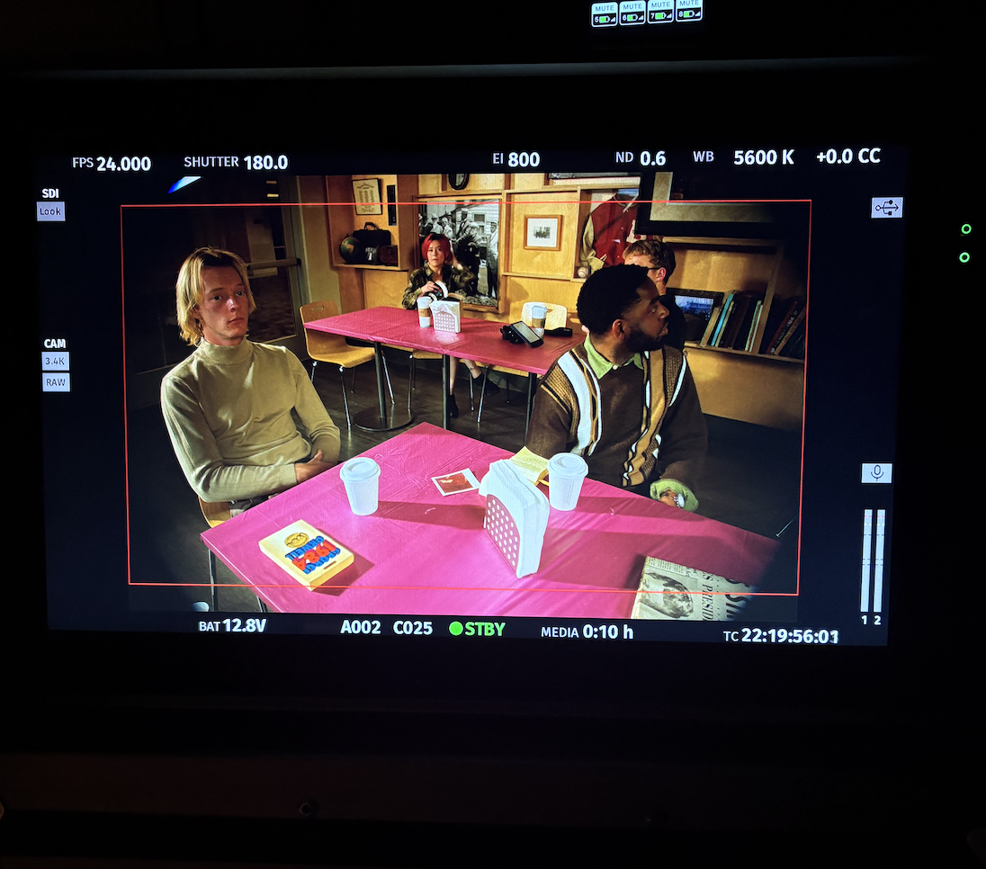
Ramona is a feature-length romantic dramedy set on a Christian university campus, following two former high school friends—Sam and Ramona—as they reconnect over one night filled with nostalgia, confession, humor, and emotional honesty. As Costume Designer, I created the visual identities of each character through wardrobe, shaping the film’s tone, character dynamics, and comedic beats. Because the story balances realism with heightened campus culture, the costumes needed to feel authentic to student life while supporting the film’s humor, emotional shifts, and ensemble interactions.
Design Goals & Concept
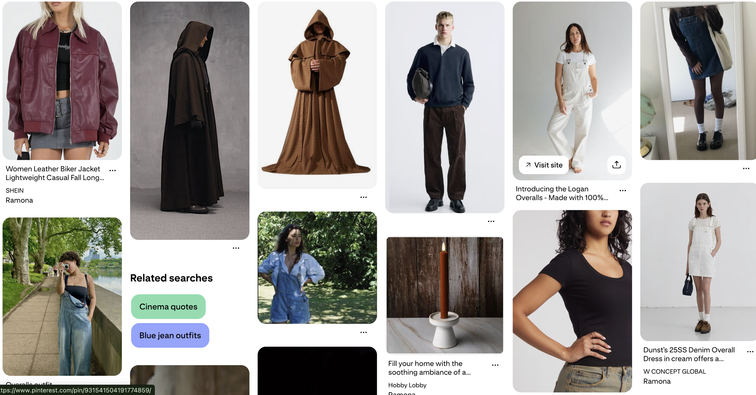
The costume design focused on grounding the characters in recognizable college archetypes while still giving each a distinct visual language that communicates personality and narrative function.
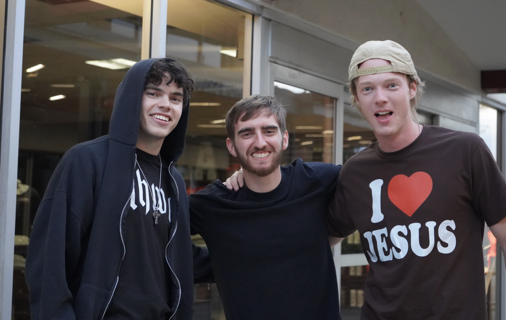
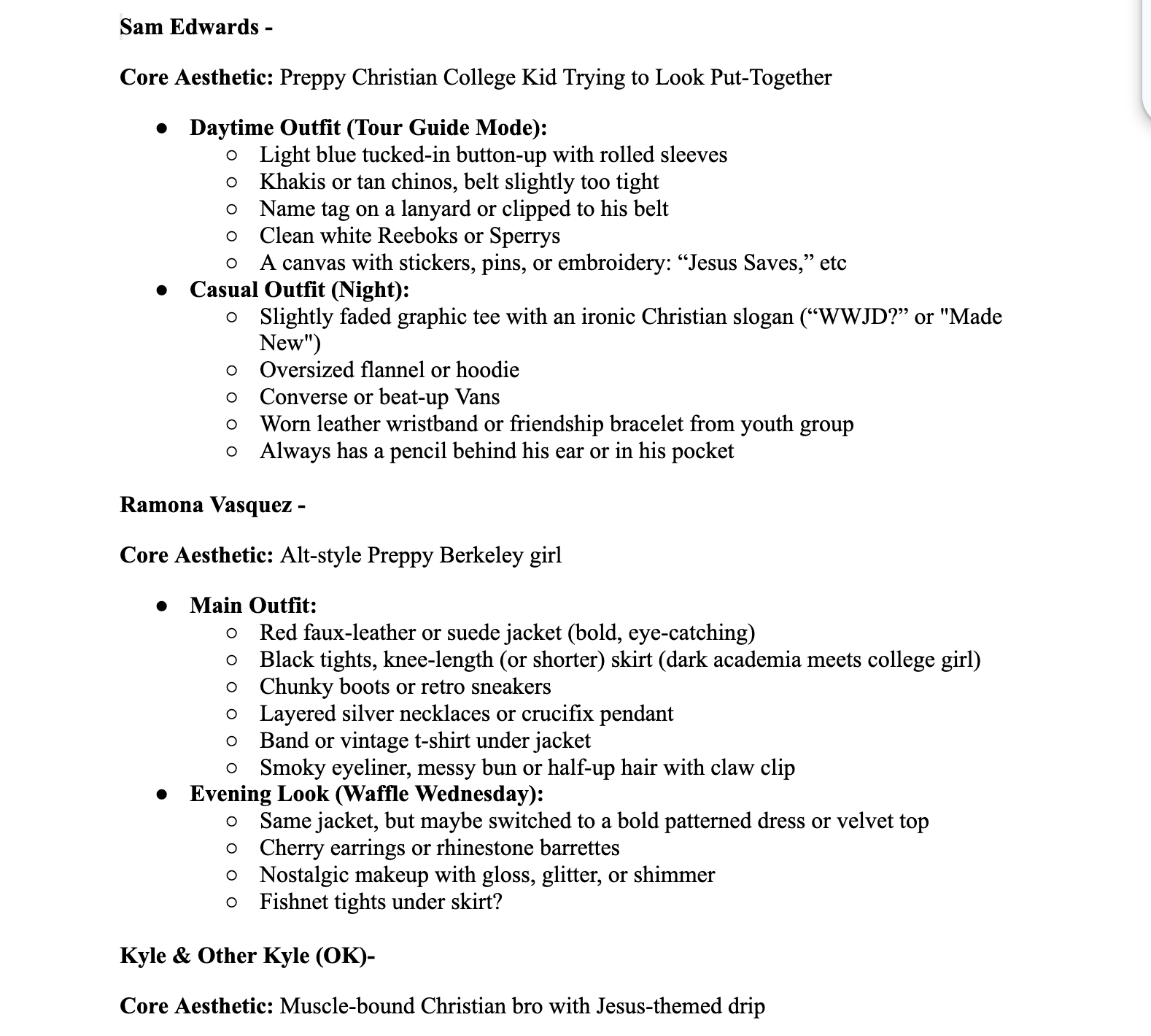
For Ramona, her wardrobe reflects someone caught between intellectual depth and disarming simplicity—soft textures, practical layers, neutral palettes, and her signature overalls create a look that is memorable, youthful, and emotionally readable.
For Sam, his tour-guide polos, khakis, and clean-cut outfits represent his desire to appear put-together and responsible, while subtle inconsistencies (like obsessively clean khakis or a slightly outdated polo) hint at his underlying insecurity.
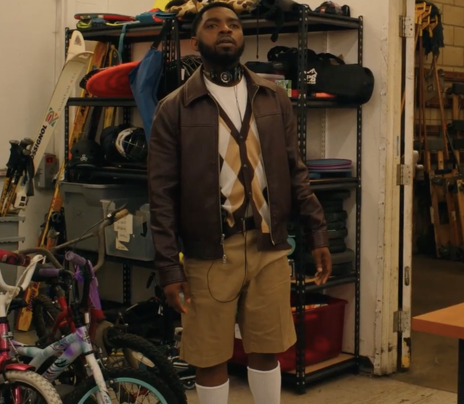
The broader ensemble—Hailey’s coordinated “girl squad,” the Waffle Wednesday crowd, worship jocks, SOCS members, and chaotic party-goers—required creating quick, recognizable silhouettes that matched the comedic tone of each group.
The goal was to make costumes function as characterization: the audience should understand who someone is before they speak.
Responsibilities as Costume Designer
As the Costume Designer for Ramona, I was responsible for:
Creating complete wardrobe concepts for the leads and ensemble, tailored to personality, humor, and emotional arcs
Developing color palettes and signature silhouettes for each character group (tour guides, theology students, club booths, party attendees, SOCS, etc.)
Sourcing, fitting, and modifying costumes to ensure authenticity to college culture and the characters’ backgrounds
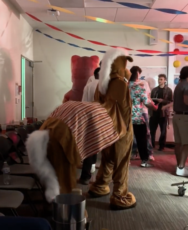
Designing standout looks for key comedic sequences (Waffle Wednesday outfits, worship jocks, SOCS ceremonial robes, club booth costumes)
Managing continuity across a feature-length shooting schedule with many locations and moving pieces
Collaborating with the director and production designer to unify costume choices with set environment and tone
Preparing duplicates or modified versions of wardrobe pieces for stunts, dancing, or crowd scenes
Overseeing on-set adjustments and maintaining costume quality over long nights of shooting and high-energy sequences
Final Result
The final wardrobe helped define the film’s warm, humorous, and emotionally sincere tone. Costumes supported character arcs, elevated jokes, and visually differentiated the many groups that populate Sam and Ramona’s world. Each look—from Sam’s earnest khakis to Ramona’s soft, nostalgic layers to the chaotic Waffle Wednesday ensembles—contributed to a cohesive, character-driven visual identity that enhanced the storytelling throughout the film.
Below are costume research, fitting photos, and behind-the-scenes photos that document the design process and execution.
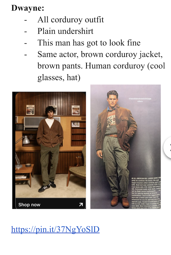
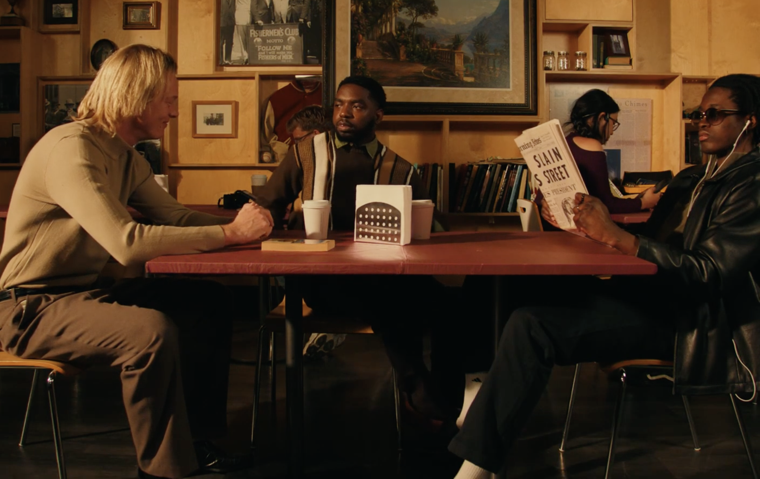
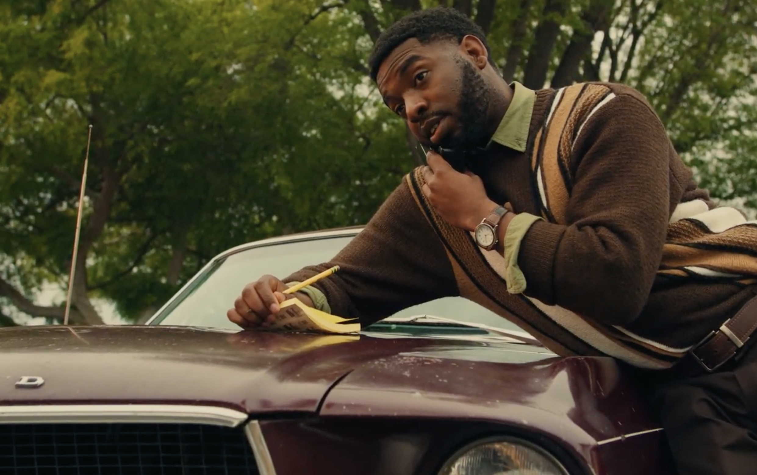
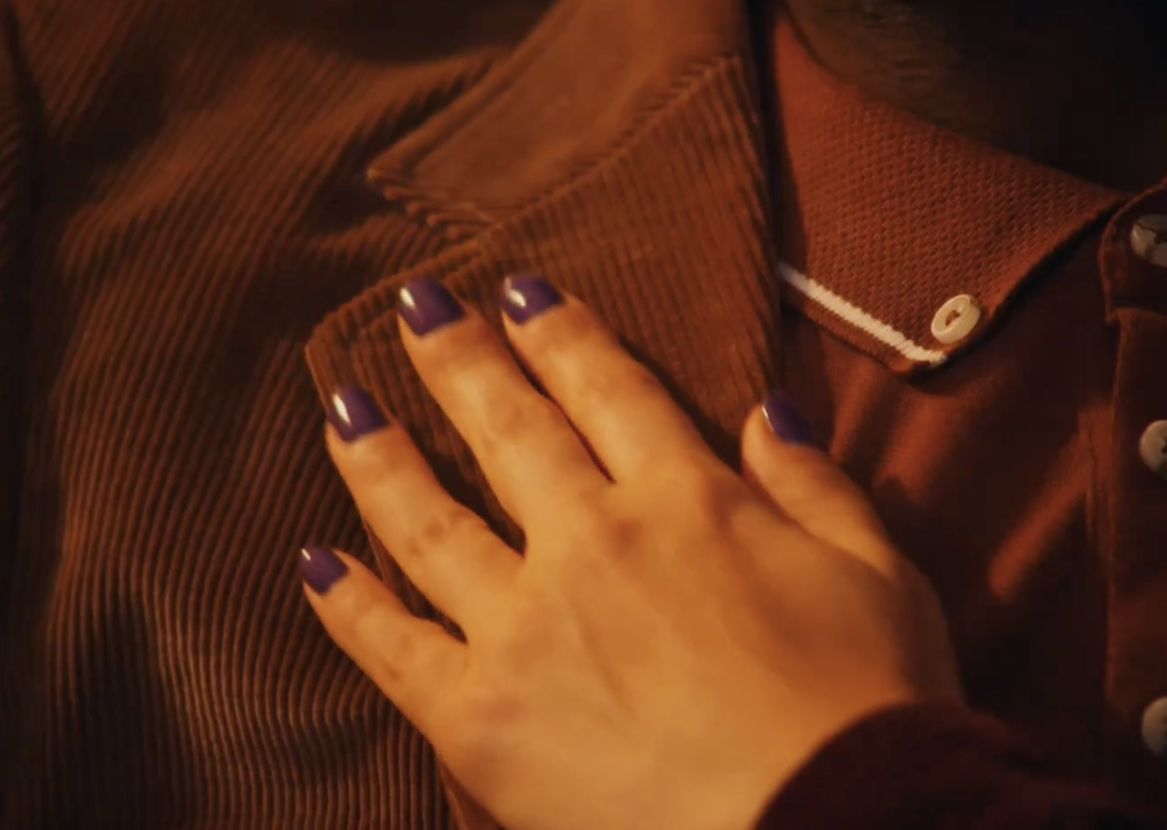
Corduroy Dreams
Biola University - 18-Minute Short Film
Role: Costume Designer
Additional Recognition: Nominated for Achievement in Costume Design – Biola Film Festival
Project Overview
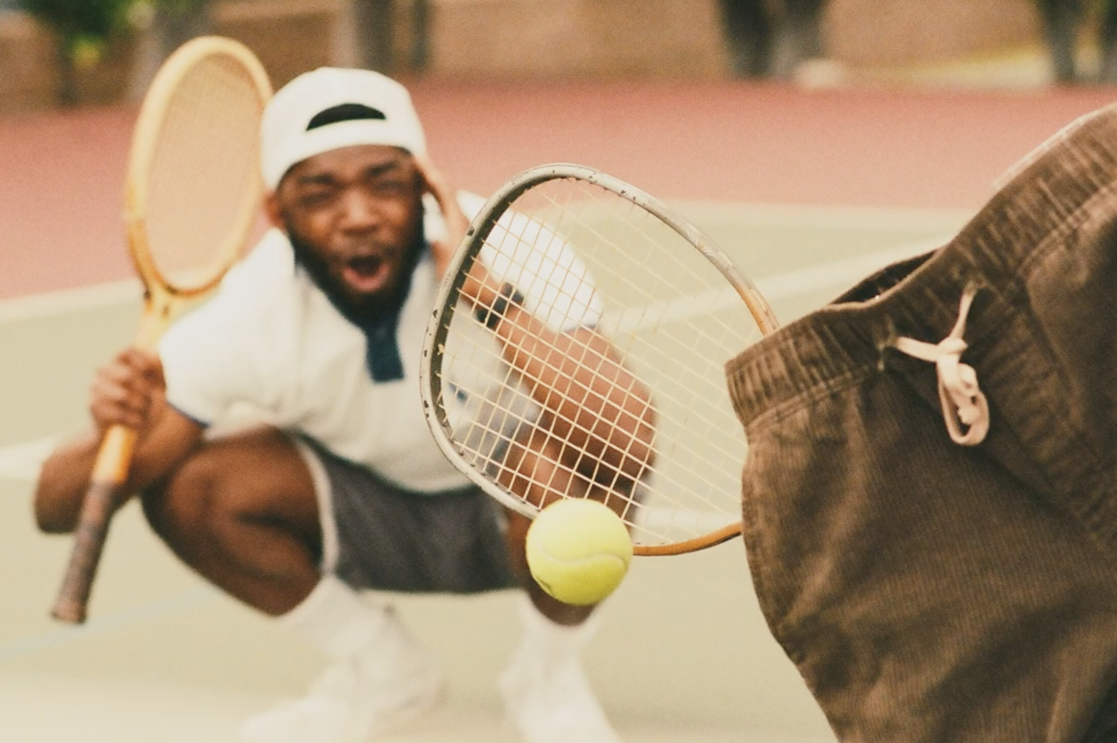
Corduroy Dreams is an 18-minute comedy about Adam, a college student obsessed with vintage fashion—particularly corduroy pants. After searching thrift stores across town for the perfect pair, Adam becomes convinced that finding the right outfit will help him finally impress the girl he likes. What begins as a simple quest for clothing quickly spirals into an absurd night of misadventures, culminating in a chaotic party and an over-the-top fashion showdown.
The film blends surreal humor, romantic fantasy, and retro aesthetics, using fashion as both the subject of the comedy and the emotional driver of the story.
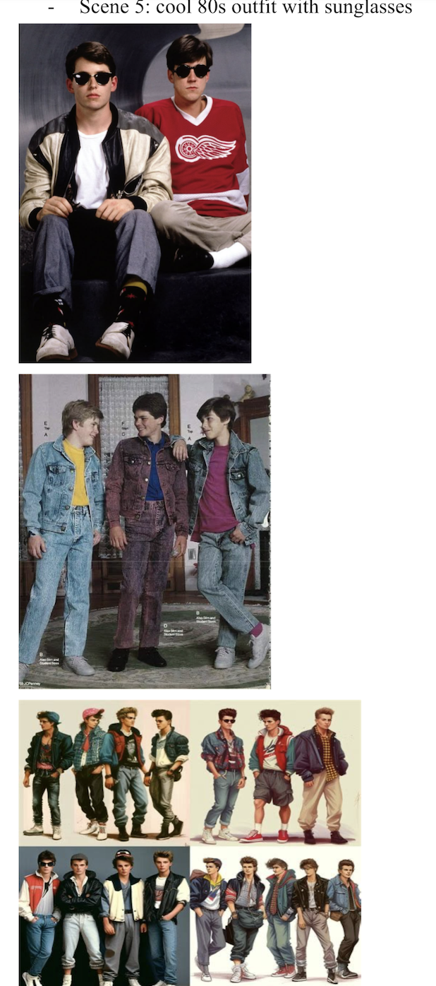
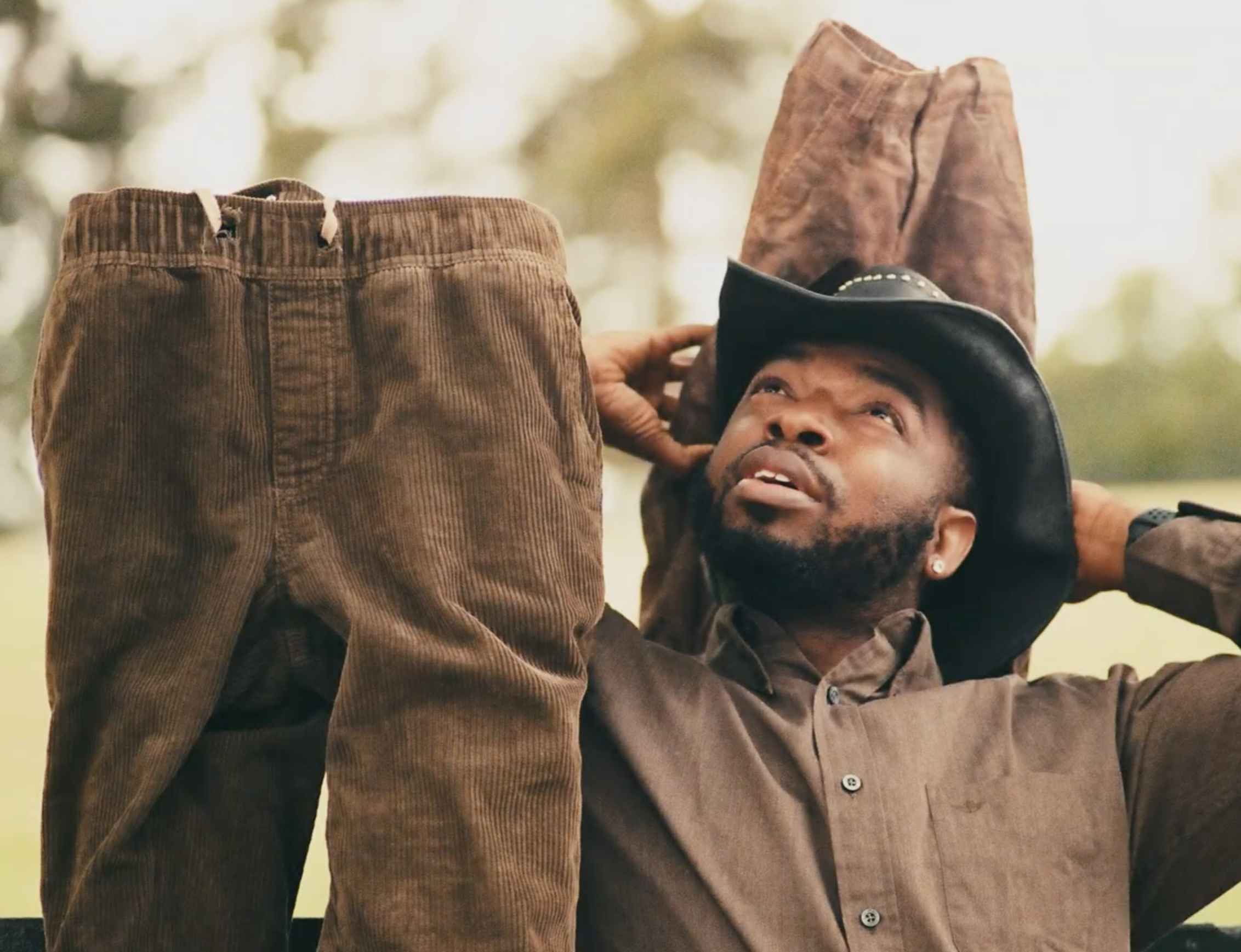
As Costume Designer, I developed the wardrobe style for the film, drawing heavily from 1970s–1980s vintage fashion. Clothing plays a central narrative role in the film, so the costumes were designed to highlight personality, confidence, and the characters’ relationship to style.
Design Goals and Concept
The costume design for Corduroy Dreams was built around the idea that fashion reflects identity and aspiration. Each character’s wardrobe visually communicates their confidence, personality, and place within Adam’s world.
Adam begins the film wearing outfits that feel slightly mismatched and incomplete—suggesting someone who admires vintage fashion but hasn’t fully mastered it yet. His wardrobe combines thrifted pieces with awkward styling choices that emphasize his insecurity and desire to fit into a specific aesthetic.
Other characters represent different levels of fashion confidence. Some appear effortlessly stylish in curated vintage outfits, while others exaggerate the retro aesthetic through bold silhouettes, textures, and accessories. These contrasts help heighten the film’s comedic tone and reinforce Adam’s internal struggle with self-image.
Corduroy itself became the central visual motif of the costume design. Texture, fabric weight, and silhouette were used intentionally to make the material visually distinct and memorable on screen.
Key costume ideas included:
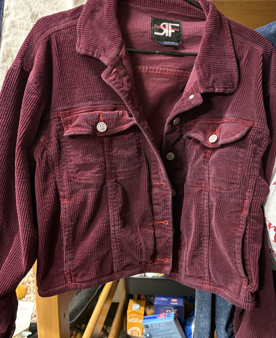
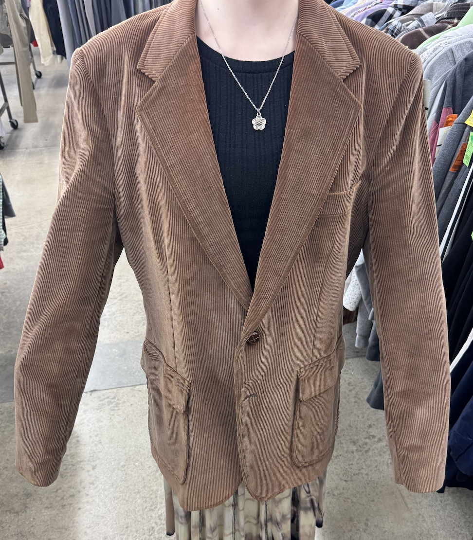
Incorporating 1970s–1980s inspired silhouettes and textures throughout the wardrobe
Using corduroy as a recurring visual motif tied to Adam’s personal goal
Designing outfits that exaggerate character personality for comedic effect
Creating a cohesive vintage aesthetic for the party environment and supporting characters
The wardrobe evolves alongside Adam’s emotional arc, culminating in a moment where his confidence finally matches the aesthetic he has been chasing.
Responsibilities as Costume Designer
As Costume Designer, I was responsible for sourcing, styling, and coordinating wardrobe for the film’s cast while maintaining a consistent retro aesthetic.
My responsibilities included:
Developing the overall costume concept inspired by vintage fashion culture
Sourcing wardrobe pieces from thrift stores and vintage collections
Styling the main character’s outfits to reflect his evolving relationship with fashion
Selecting and styling the signature corduroy look that becomes central to the story
Coordinating wardrobe for party scenes to create a cohesive retro aesthetic among background characters
Maintaining costume continuity across scenes and locations
Working with the director and production designer to ensure costumes complemented the visual world of the film
Because clothing is central to the film’s humor and character development, careful attention was paid to fabric choices, color palettes, and silhouettes.
Final Result
The final wardrobe design helped establish a playful, visually distinctive world rooted in vintage fashion culture. Corduroy, texture, and retro styling became recurring visual motifs that supported both the comedic tone and the emotional arc of the story.
Through carefully curated costumes, the film’s characters each embody a different relationship with style—from insecurity and aspiration to effortless confidence.
The costume design for Corduroy Dreams was nominated for Achievement in Costume Design at the Biola Film Festival, recognizing the role wardrobe played in shaping the film’s visual identity and storytelling.
Below are costume boards, thrifted wardrobe pulls, texture references, production stills, and behind-the-scenes photos documenting the costume design process.
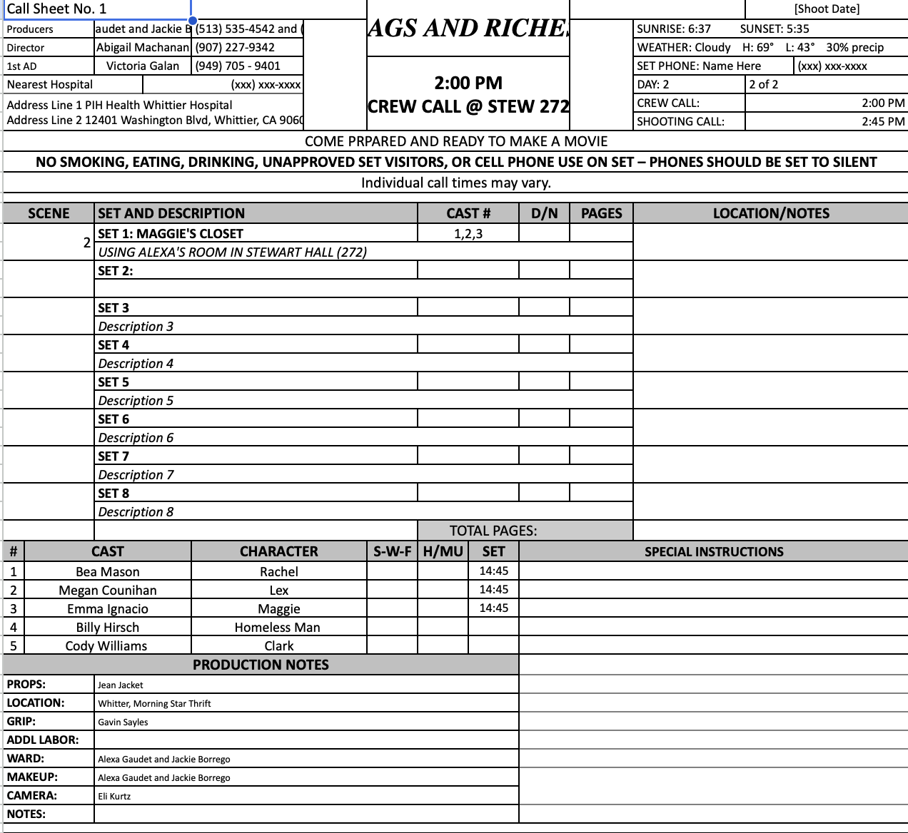
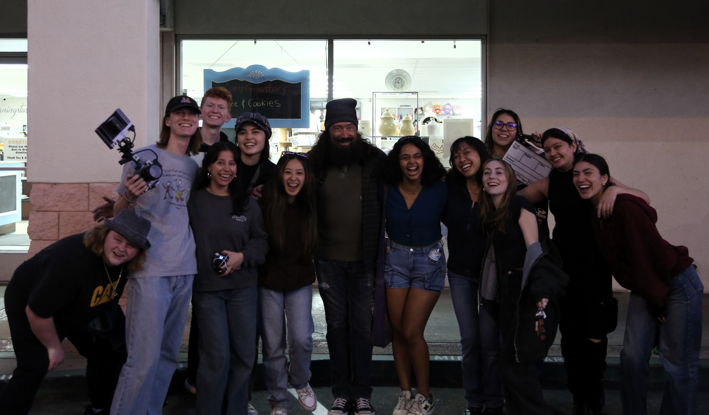
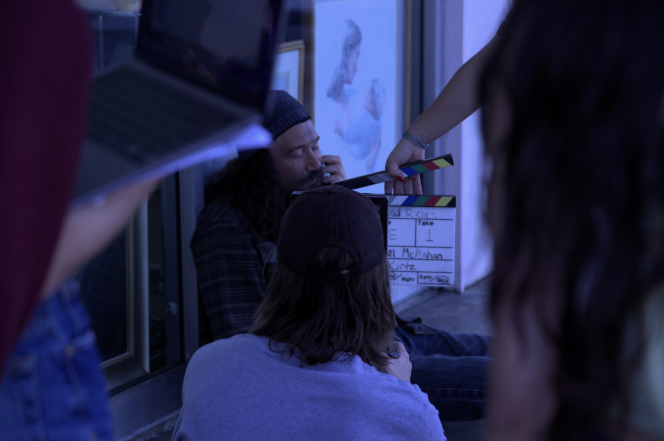
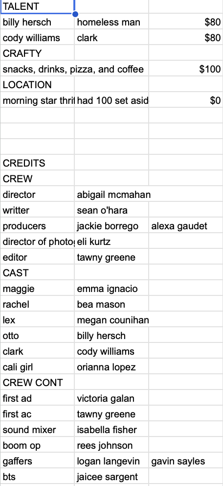
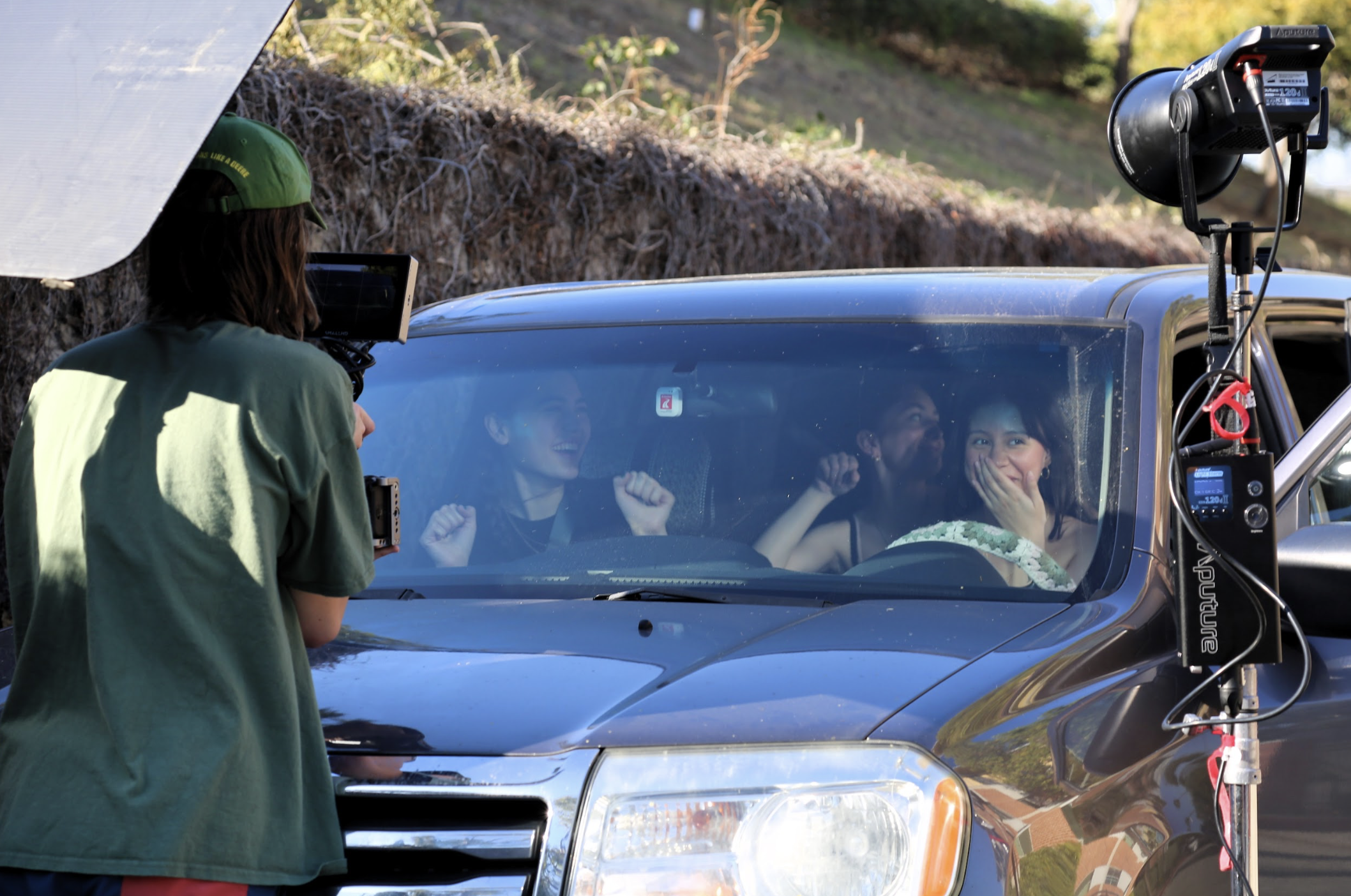
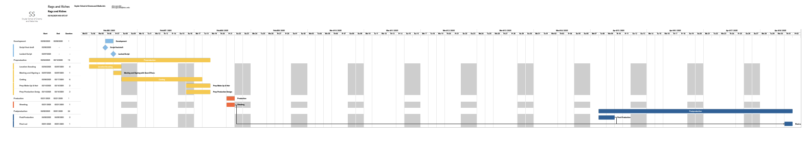
Rags and Riches
Biola University - 8 minute Short Film
Role: Co-Producer
Project Overview
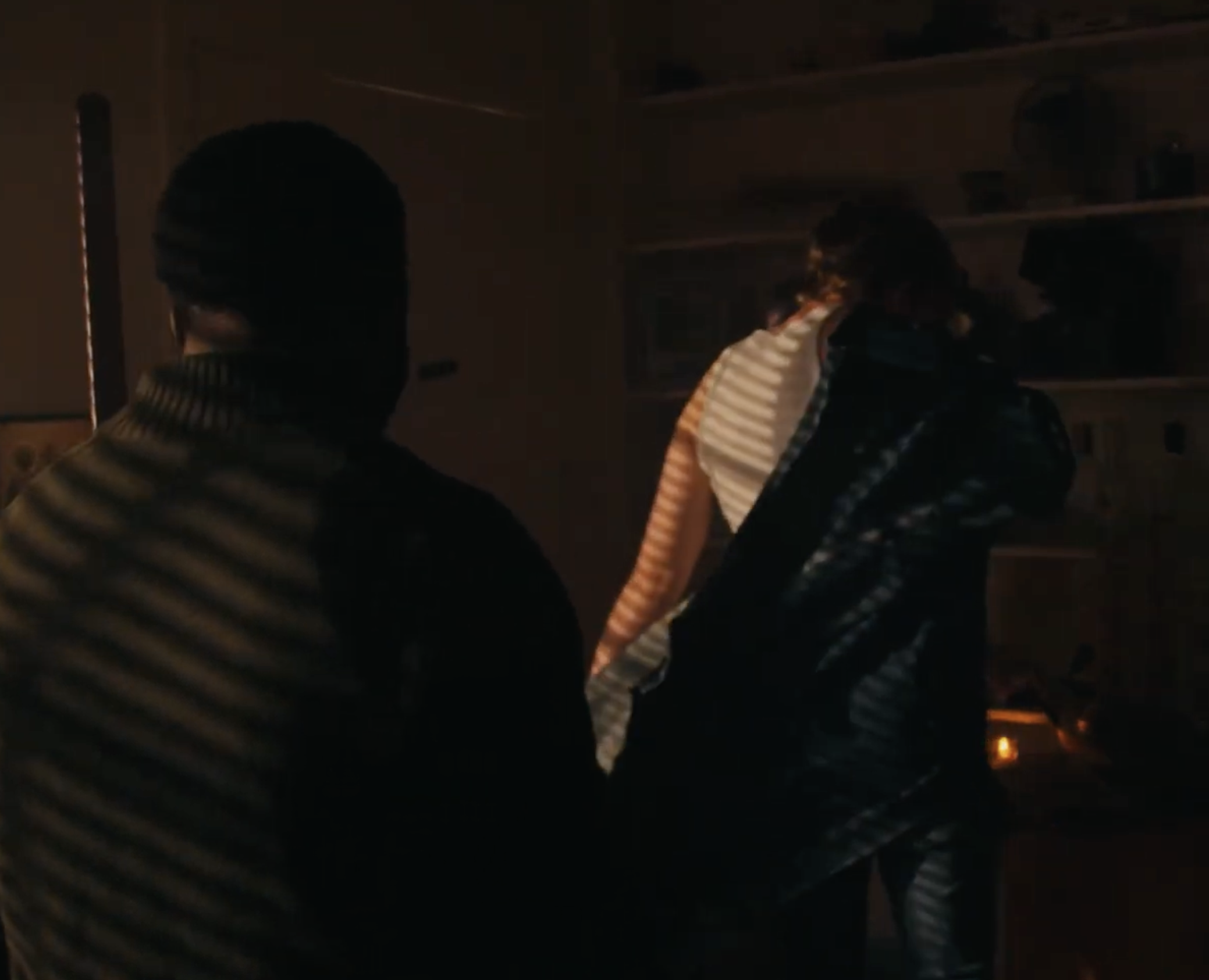
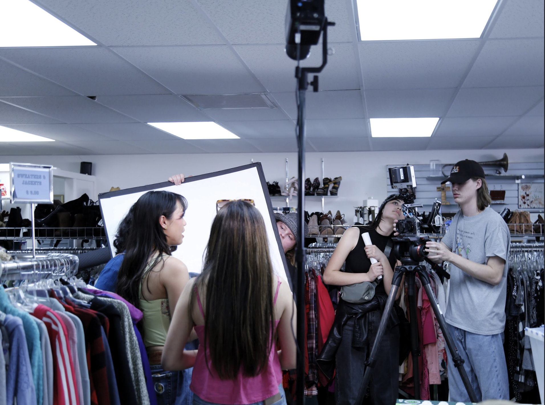
Rags & Riches is a character-driven short film that follows three friends on a spontaneous thrift store run that unexpectedly turns into an act of generosity. What begins as a lighthearted mission to find the perfect outfit for a party evolves into a story about dignity, confidence, and quiet kindness.
Set almost entirely inside a thrift store, the film balances comedic energy with emotional sincerity. Through Maggie’s encounter with Otto, a man browsing the racks alone, the narrative shifts from playful chaos to meaningful connection, showing how small choices can deeply impact someone’s day. Rags & Riches Script
As Co-Producer, I helped bring this contained, dialogue-heavy story to life—ensuring the tone remained cohesive while managing the logistical demands of a location-driven shoot.
Producing Goals and Vision
Because the film moves between high-energy montage sequences and intimate emotional beats, one of our primary goals was maintaining tonal balance. The thrift store needed to feel vibrant and chaotic in moments of comedy, yet tender and reflective during Maggie and Otto’s interaction.
From a producing standpoint, this meant:
Securing a practical location that could support both dynamic movement and quiet performance
Structuring the schedule to allow flexibility for improvisational energy in montage scenes
Protecting time for the emotionally significant final sequences
The heart of the story rests in the denim jacket exchange—a moment that transforms the film from quirky to compassionate. My role involved safeguarding that emotional arc from pre-production through post, ensuring the film never lost sight of its central message: generosity restores dignity.
Responsibilities as Co-Producer
As Co-Producer for Rags & Riches, I was responsible for:
Assisting in budgeting and production planning for a single-location narrative
Coordinating with the location to secure filming permissions and manage on-site logistics
Supporting casting coordination and communication between departments
Overseeing scheduling to accommodate ensemble scenes and montage sequences
Managing on-set problem-solving and maintaining production flow
Collaborating with the director to preserve tonal consistency between comedy and drama
Supporting post-production coordination and delivery timelines
Because the story depends heavily on performance chemistry and pacing, much of my focus centered on keeping morale high, protecting creative space for the actors, and ensuring the emotional beats were never rushed.
Final Result
Rags & Riches delivers a warm, character-centered narrative that begins in humor and ends in heartfelt generosity. The contained thrift store setting becomes more than a backdrop—it transforms into a space of rediscovered confidence and unexpected grace.
The final scene, with Otto dancing down the street in his gifted denim jacket, encapsulates the film’s spirit: joy can be sparked by the smallest act of kindness. Rags & Riches Script
Below are production stills, behind-the-scenes images, and development materials documenting the collaborative process that brought Rags & Riches to life.
One Last Time
Biola University — 6-Minute Short Film
Role: Production Designer
Additional Recognition: Grand Jury Prize – Best Short, San Diego International Kids Film Festival
Project Overview
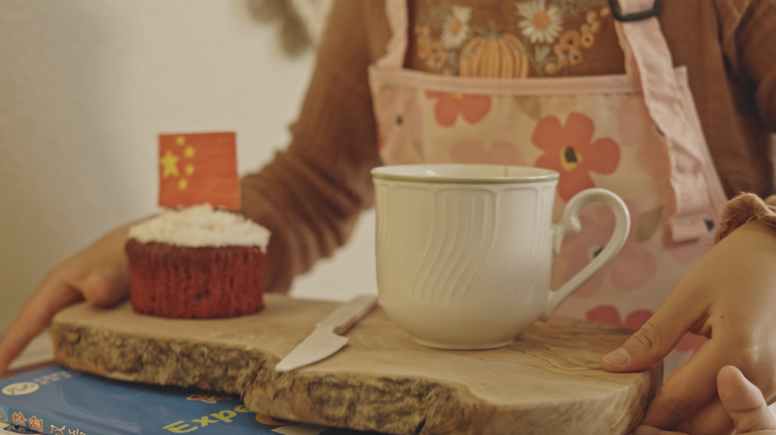
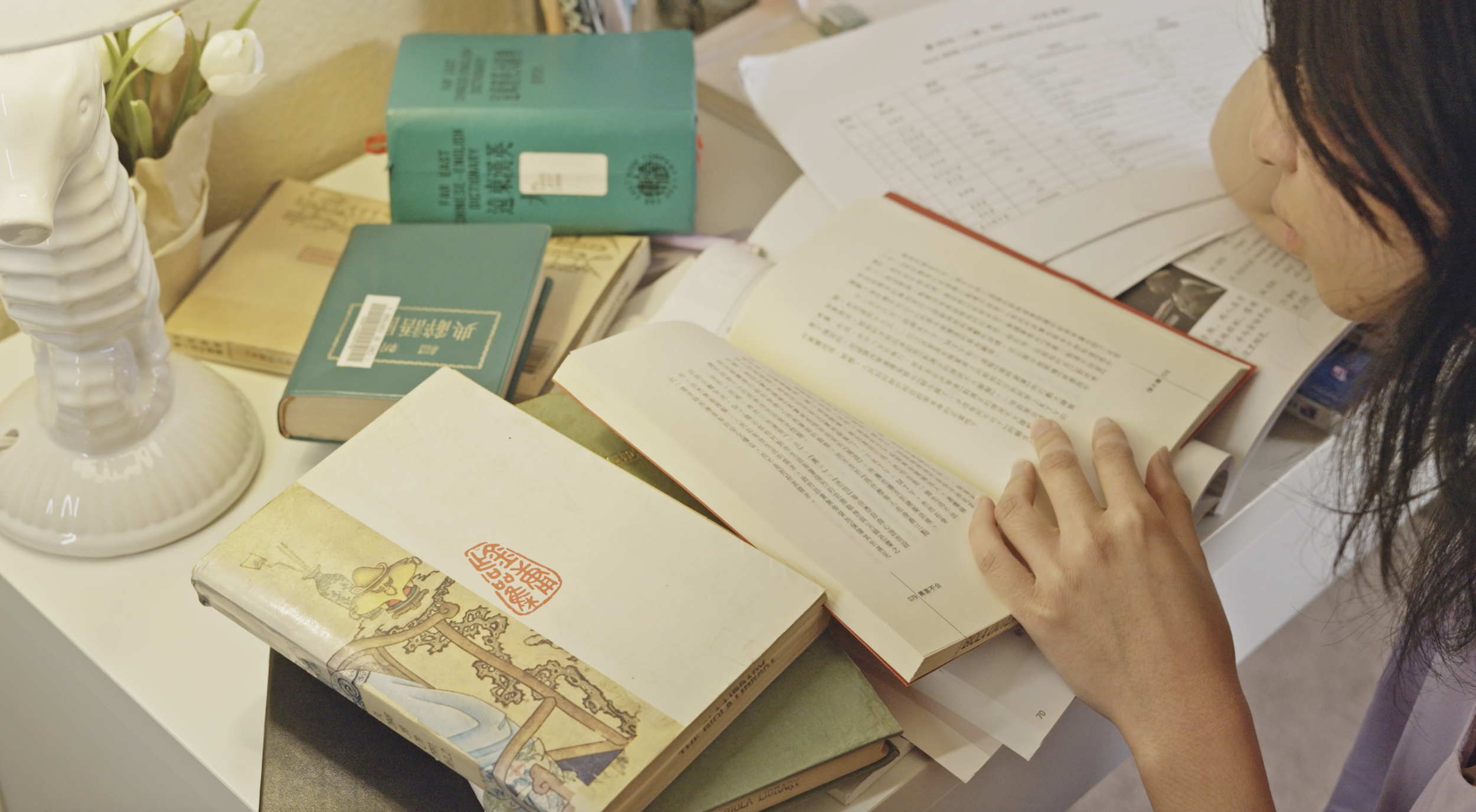
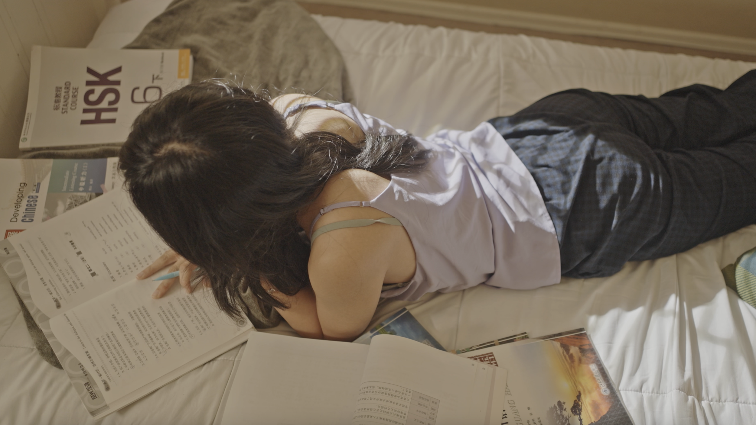
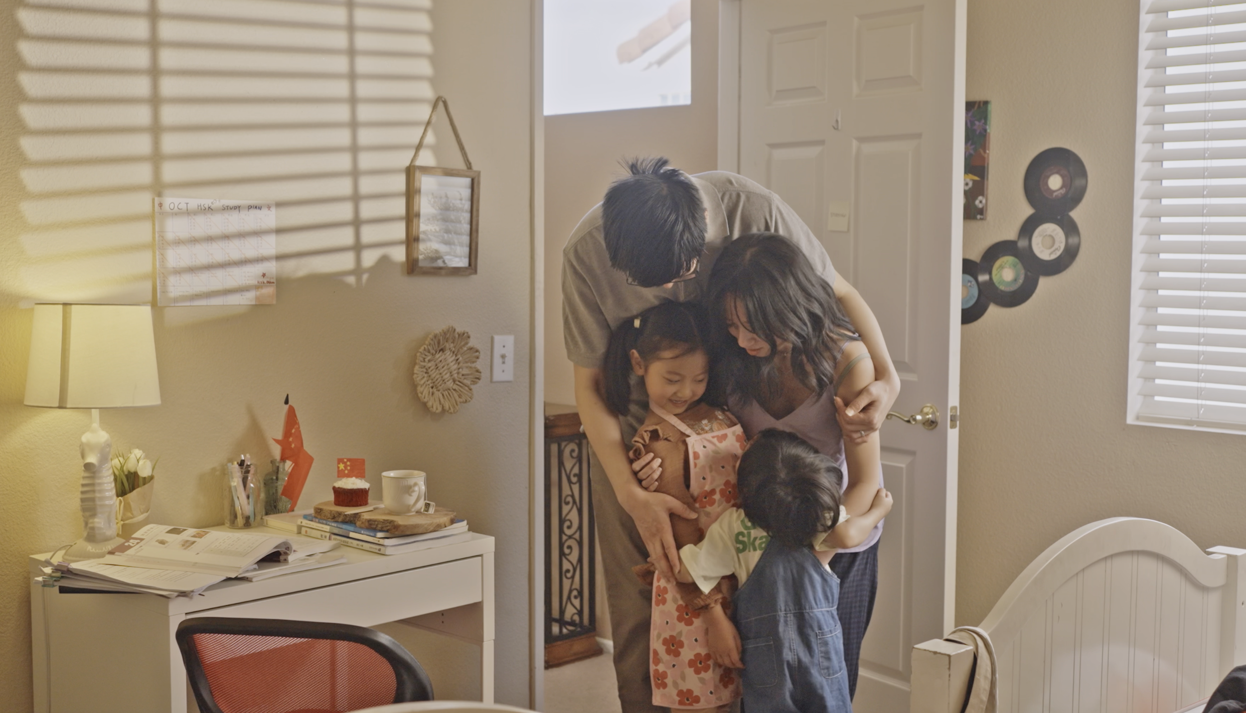
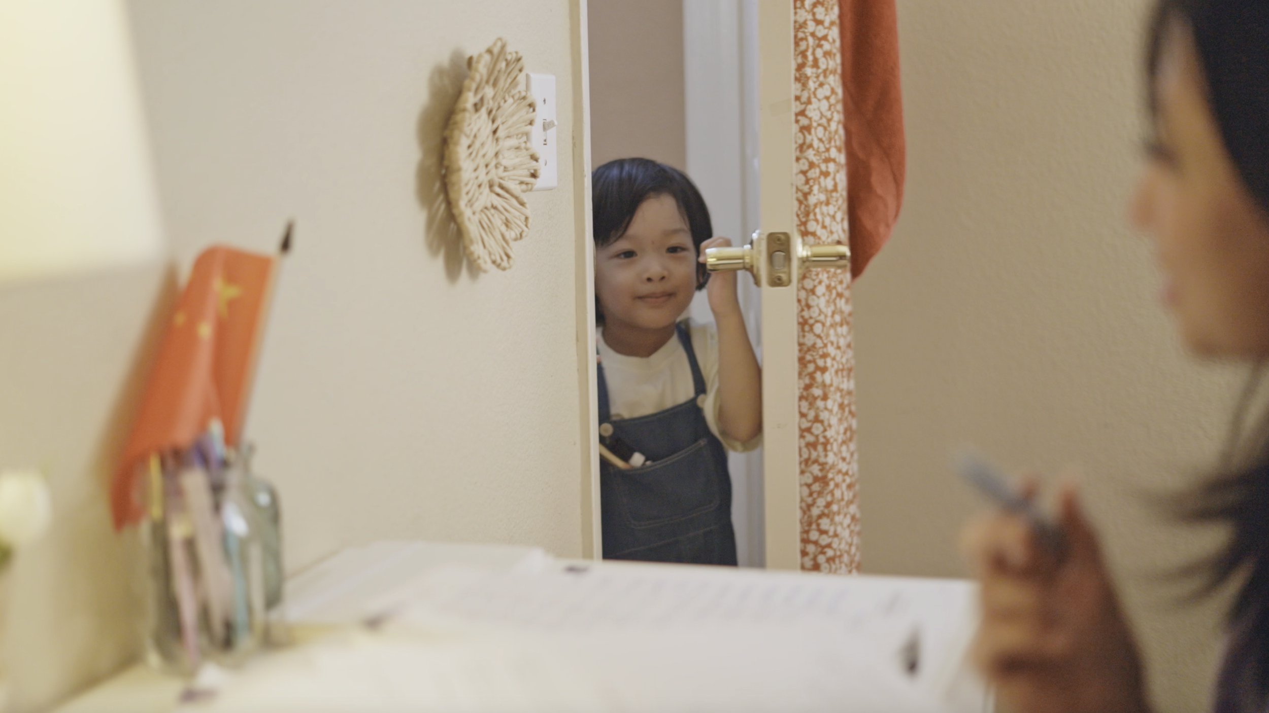
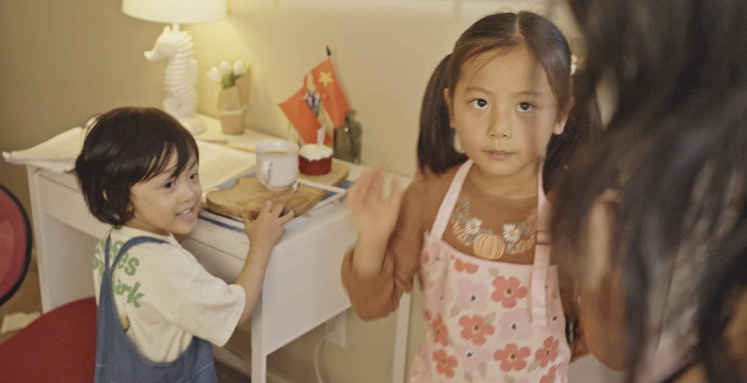
One Last Time is a 6-minute narrative short inspired by a true story that follows Elena, a high school student overwhelmed by the pressure of studying for a major Chinese language exam while navigating grief and family expectations. As she isolates herself in her room to focus on studying, her younger siblings repeatedly interrupt her with small requests, slowly revealing the dynamics of a household learning to cope after the loss of their mother.
What initially appears to be a series of frustrating distractions ultimately builds toward an emotional moment when Elena discovers that her siblings have been preparing a small birthday surprise for her. The film explores themes of family, cultural identity, grief, and the quiet ways love is expressed within everyday moments.
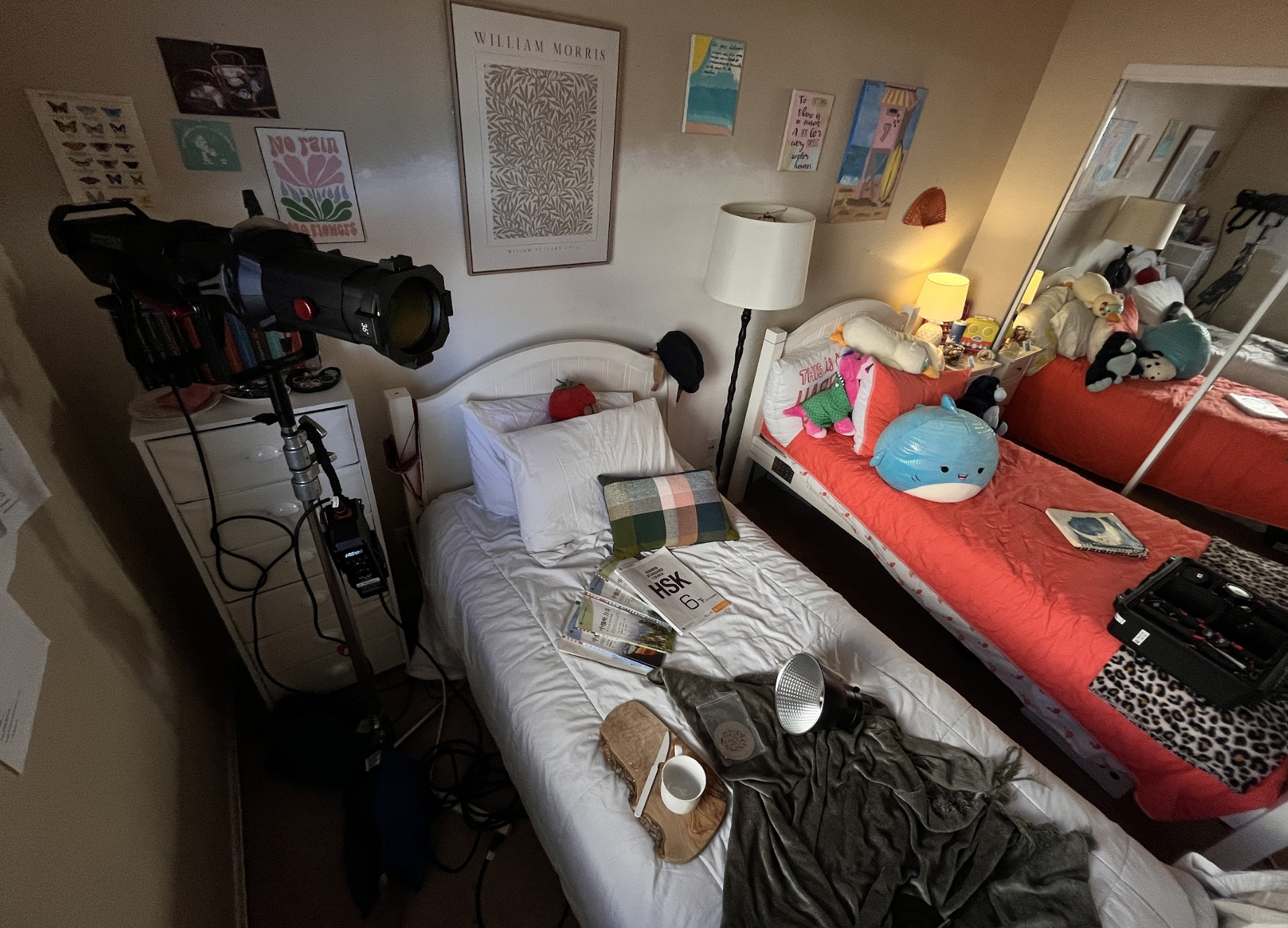
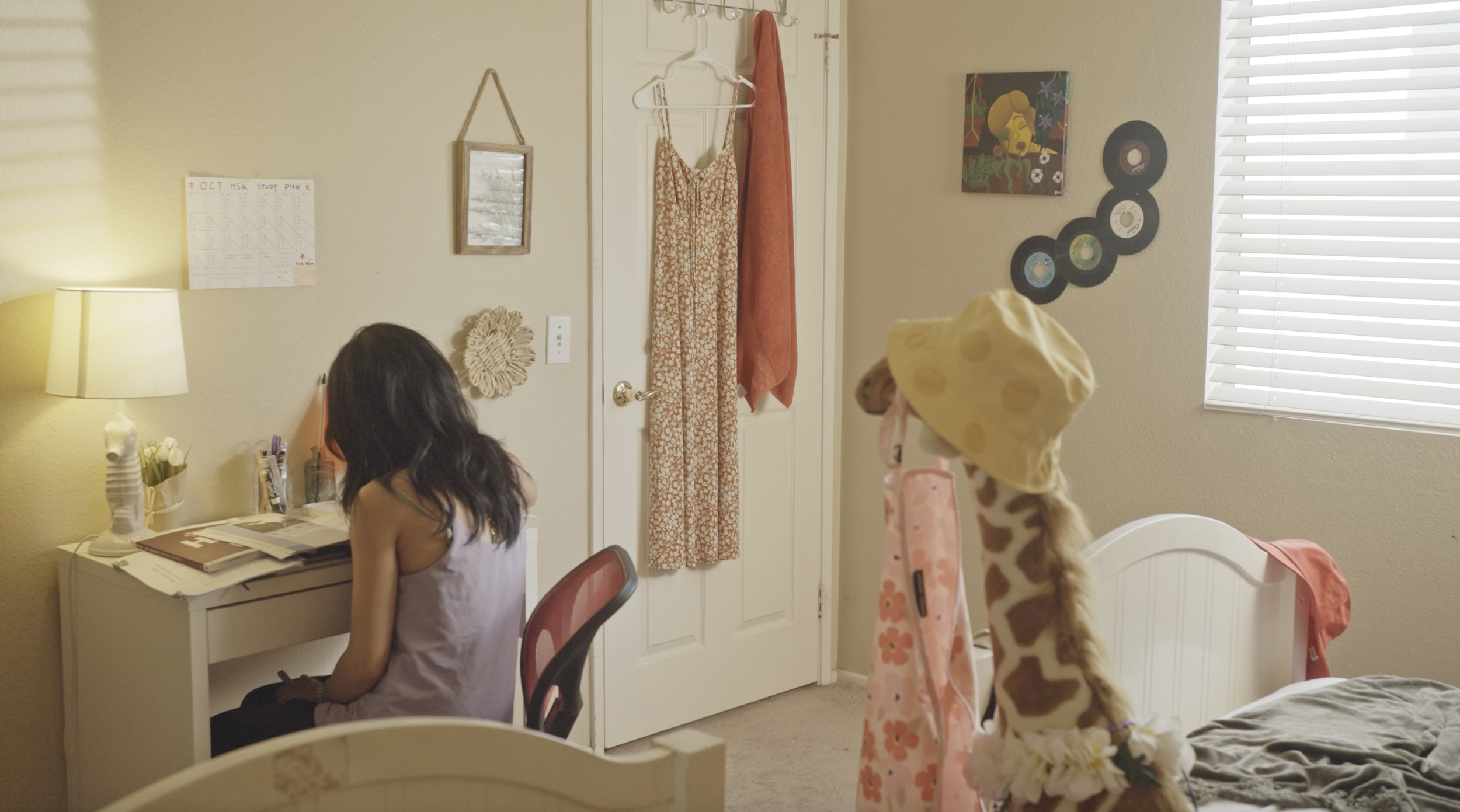
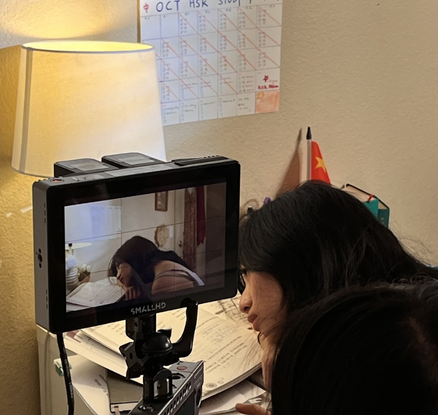
As Production Designer, I developed the visual environment of Elena’s room and surrounding household spaces to reflect the emotional tension between academic pressure, cultural identity, and family life.
Design Goals and Concept
The design for One Last Time centered on creating a single intimate environment that visually communicates Elena’s mental and emotional state. Because most of the film takes place in her bedroom, the space needed to carry both narrative and emotional weight.
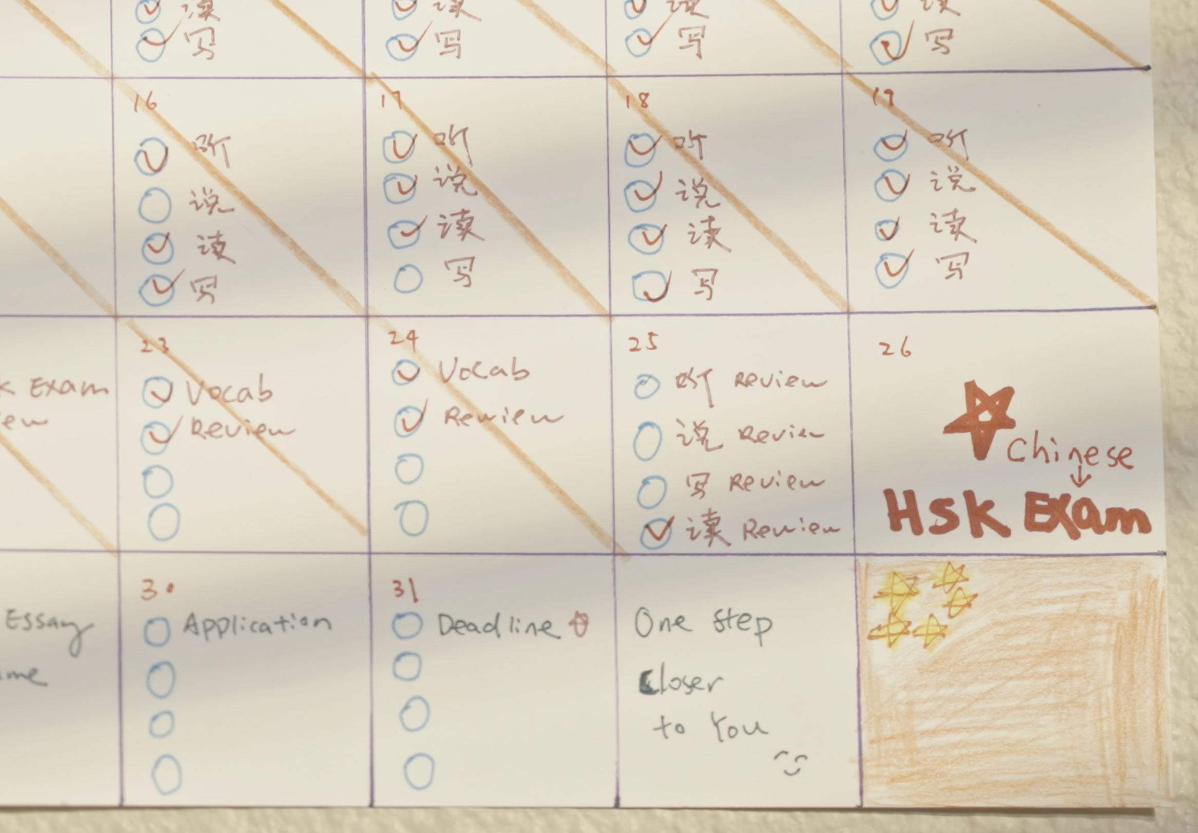
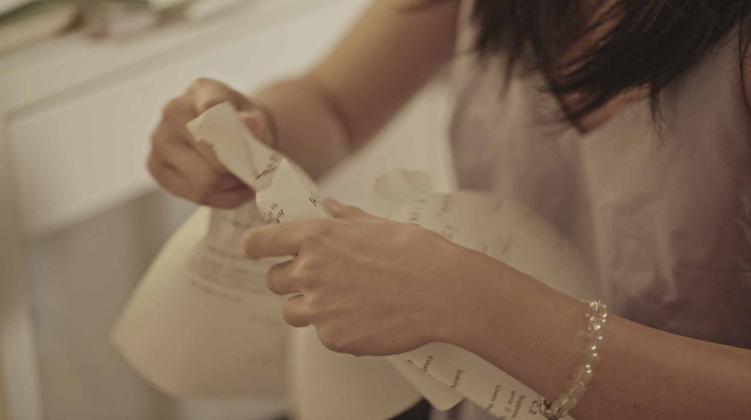
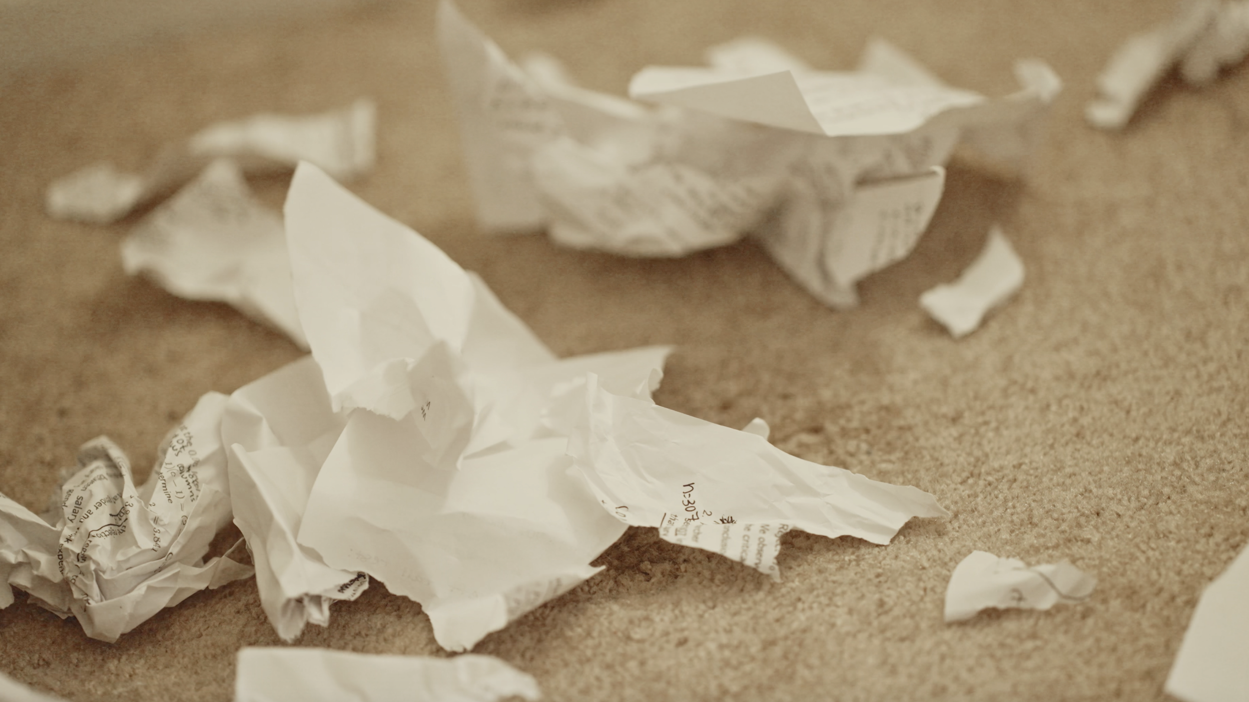
The room was designed to feel filled with academic materials—language textbooks, practice exams, dictionaries, and scattered study notes—to emphasize Elena’s intense focus on preparing for the exam. A study plan and calendar with deadlines were prominently displayed on the wall to visually reinforce the pressure she feels to succeed.
Cultural identity also plays a subtle role in the design. Elements such as a Chinese flag and language materials throughout the room connect Elena’s studies with her family background and the larger question of pursuing education abroad. These details help visually support the film’s themes without overwhelming the intimate setting.
As Elena’s stress increases throughout the story, the room gradually becomes more chaotic—papers scatter across the floor, books pile up on the desk, and the carefully organized study environment begins to fall apart. This visual shift mirrors her emotional frustration before the final scene restores a sense of warmth and connection through her siblings’ surprise.
Key design ideas included:
Creating a realistic student study environment filled with books, study materials, and handwritten notes
Using visual clutter to reflect academic pressure and emotional stress
Incorporating subtle cultural elements that connect Elena to her family’s heritage
Designing the space so it could transition from tension and isolation to warmth in the final moment
Responsibilities as Production Designer
As Production Designer, I was responsible for shaping the film’s primary environment and ensuring that every visual element supported the story’s emotional arc.
My responsibilities included:
Designing and dressing Elena’s bedroom to reflect the life of a student preparing for an important exam
Selecting and placing study materials, including books, notebooks, dictionaries, and practice exams
Creating visual storytelling elements such as the marked study calendar and wall decorations
Coordinating the placement of props used throughout the film, including stationery, personal belongings, and desk materials
Designing the visual transition of the room from an organized study space to chaotic frustration as Elena’s stress builds
Preparing the final scene’s props, including the tray with milk tea and the small birthday cake
Working closely with the director to ensure the environment supported the film’s intimate tone and emotional climax
Because the story unfolds almost entirely in a single room, careful attention to detail was essential in making the space feel both authentic and emotionally expressive.
Final Result
The final film uses a simple bedroom setting to tell a deeply personal story about grief, pressure, and family support. Through thoughtful production design, Elena’s room becomes more than just a backdrop—it visually reflects her inner struggle while grounding the film's emotional journey.
The transformation of the space—from a tense study environment to a moment of quiet celebration—helps reinforce the story’s central message about the importance of family and perseverance.
One Last Time went on to receive the Grand Jury Prize for Best Short at the San Diego International Kids Film Festival, recognizing the film’s emotional storytelling and performances.
Below are location scouting images, prop preparation, production stills, and behind-the-scenes photos documenting the design process from pre-production through filming.
Married To The Bone
Biola University - 10-Minute Short Film
Role: Production Designer
Project Overview
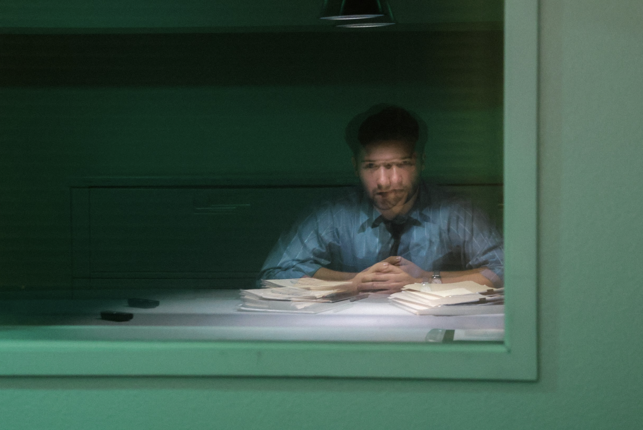
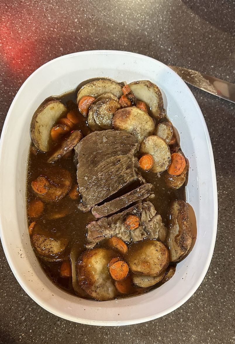
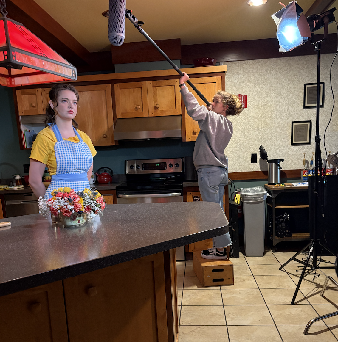
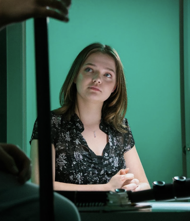
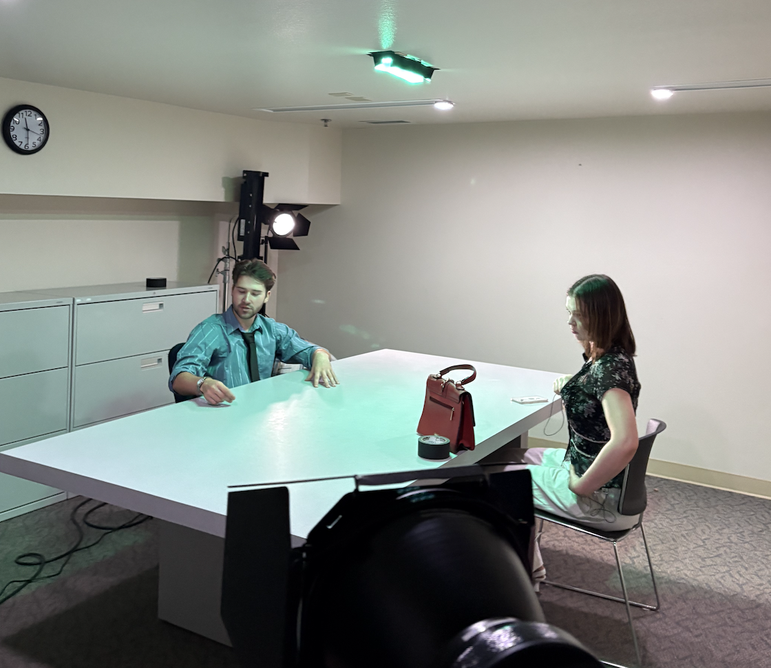
Married to the Bone is a 10-minute dark comedy–horror short that blends retro domestic aesthetics with psychological tension. The film follows Jane Adwin, a seemingly cheerful housewife, presenting a vintage-style cooking demonstration on how to prepare roast beef. What initially appears to be a charming instructional cooking segment gradually transitions into a police interrogation, where Jane recounts the events leading up to her husband’s disappearance.
As the conversation unfolds, it becomes clear that the domestic life Jane once embraced had slowly deteriorated under the pressure of an abusive marriage. The story ultimately reveals that the very skill she took pride in—cooking—became the means through which she reclaimed control of her life. The film uses satire, horror, and dark humor to critique traditional expectations of domestic roles and the psychological toll of toxic relationships.
As Production Designer, I developed the film's visual identity by contrasting a stylized, nostalgic kitchen environment with the stark realism of a police interrogation room.
Design Goals and Concept
The central visual concept of Married to the Bone was the contrast between cheerful domestic performance and underlying violence.
The opening cooking sequence was designed to resemble a vintage television cooking show. The kitchen environment was intentionally bright, colorful, and orderly, with neatly arranged cookware, vibrant pots and pans, and carefully staged food preparation areas. This stylized presentation reinforces the illusion of a perfect housewife performing domestic labor with enthusiasm and pride.
As the narrative transitions to the interrogation scene, the tone shifts dramatically. The interrogation room environment is intentionally stark and minimal: a plain table, a recording device, scattered paperwork, and minimal decoration. The cold, neutral atmosphere contrasts sharply with the warmth and theatricality of the kitchen.
This visual contrast reflects the duality of Jane’s character—between the image she presents and the truth beneath it.
Key design priorities included:
Creating a retro-inspired kitchen environment reminiscent of mid-century cooking shows
Using colorful cookware, neatly arranged shelves, and polished food presentation to reinforce the illusion of domestic perfection
Designing a stark interrogation environment that contrasts with the warmth of the kitchen
Supporting the film’s dark humor by presenting disturbing content through an otherwise cheerful visual style
The kitchen represents the role Jane was expected to perform, while the interrogation room reveals the consequences of that role collapsing.
Responsibilities as Production Designer
As Production Designer, I oversaw the visual world of both environments and helped execute several practical elements used in the film.
My responsibilities included:
Developing the overall visual concept that contrasts retro domestic aesthetics with a grounded police interrogation setting
Designing and dressing the vintage-inspired kitchen environment used in the cooking demonstration sequence
Preparing and cooking the roast beef used on camera, ensuring the dish looked visually appealing and consistent across takes
Selecting cookware, utensils, ingredients, and food presentation elements to replicate a stylized cooking show format
Designing the interrogation room layout, including table placement, props, and environmental tone
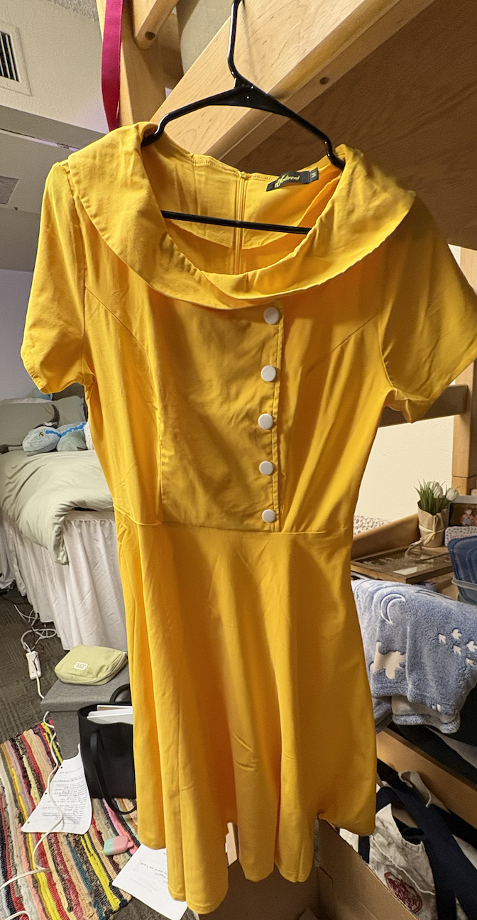
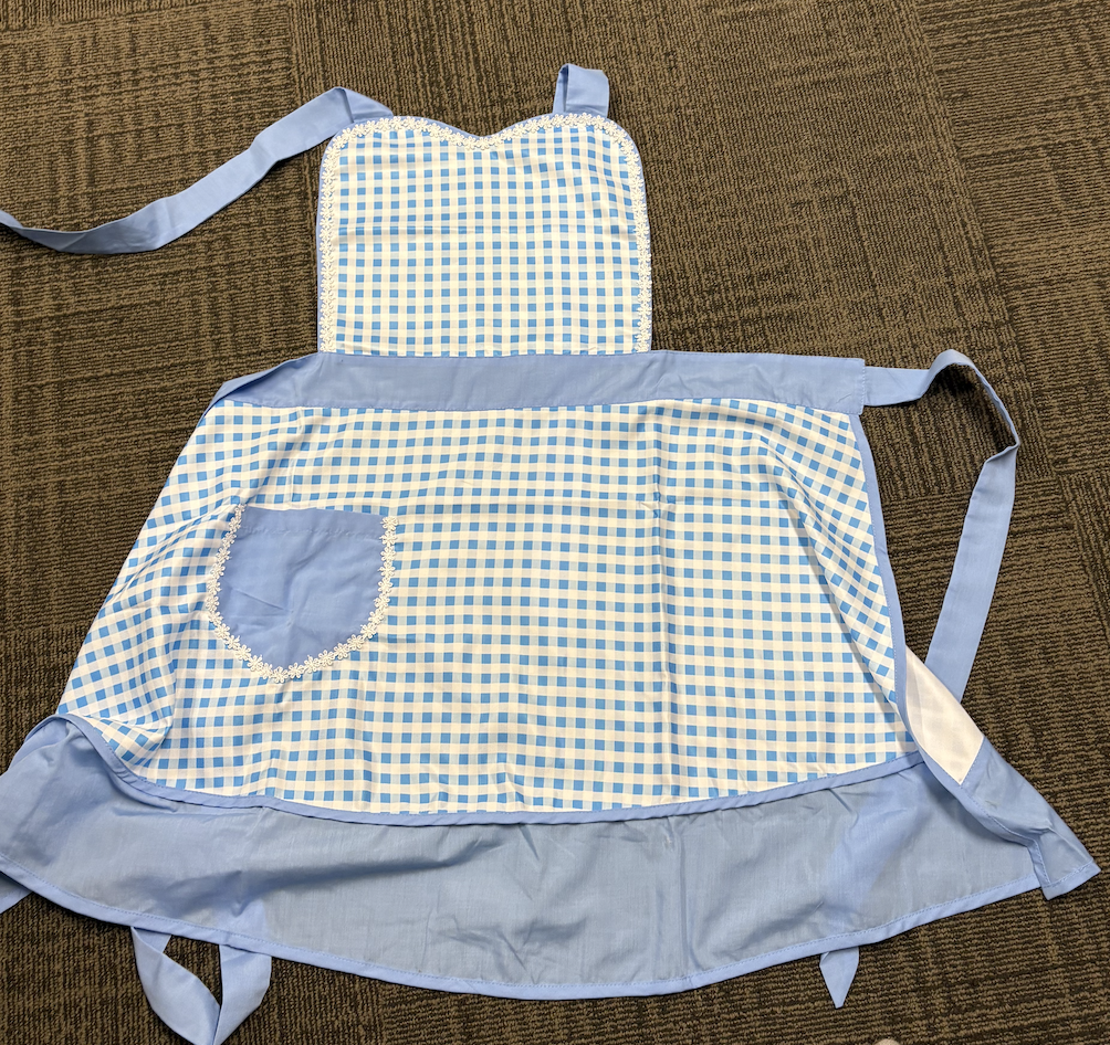
Overseeing costume design, including sourcing and styling the retro-inspired yellow shirtwaist dress and apron used by the main character to reinforce the mid-century domestic aesthetic
Working closely with the director and cinematographer to maintain a strong visual contrast between the two environments
Maintaining visual continuity between the cooking montage and interrogation scenes
Because the film moves between two drastically different tonal environments, the design and costumes work together to support the story’s shift from a cheerful domestic performance to an unsettling revelation.
Final Result
The final film visually reinforces its themes by juxtaposing a nostalgic domestic fantasy with the harsh reality of a criminal confession. The colorful, polished kitchen initially invites the audience into a familiar cooking-show format, only to gradually reveal the unsettling truth beneath Jane’s carefully constructed persona.
Through careful production design, food styling, and costume choices, the film’s visual world supports its dark satire—presenting an idealized version of domestic life before exposing the disturbing reality underneath it.
Below are sourcing images, costume pieces, prop preparation, production stills, and behind-the-scenes photos documenting the design process from pre-production through filming.
Buttered Noodles
Biola University - 11-Minute Short Film
Role: Art Director
Project Overview
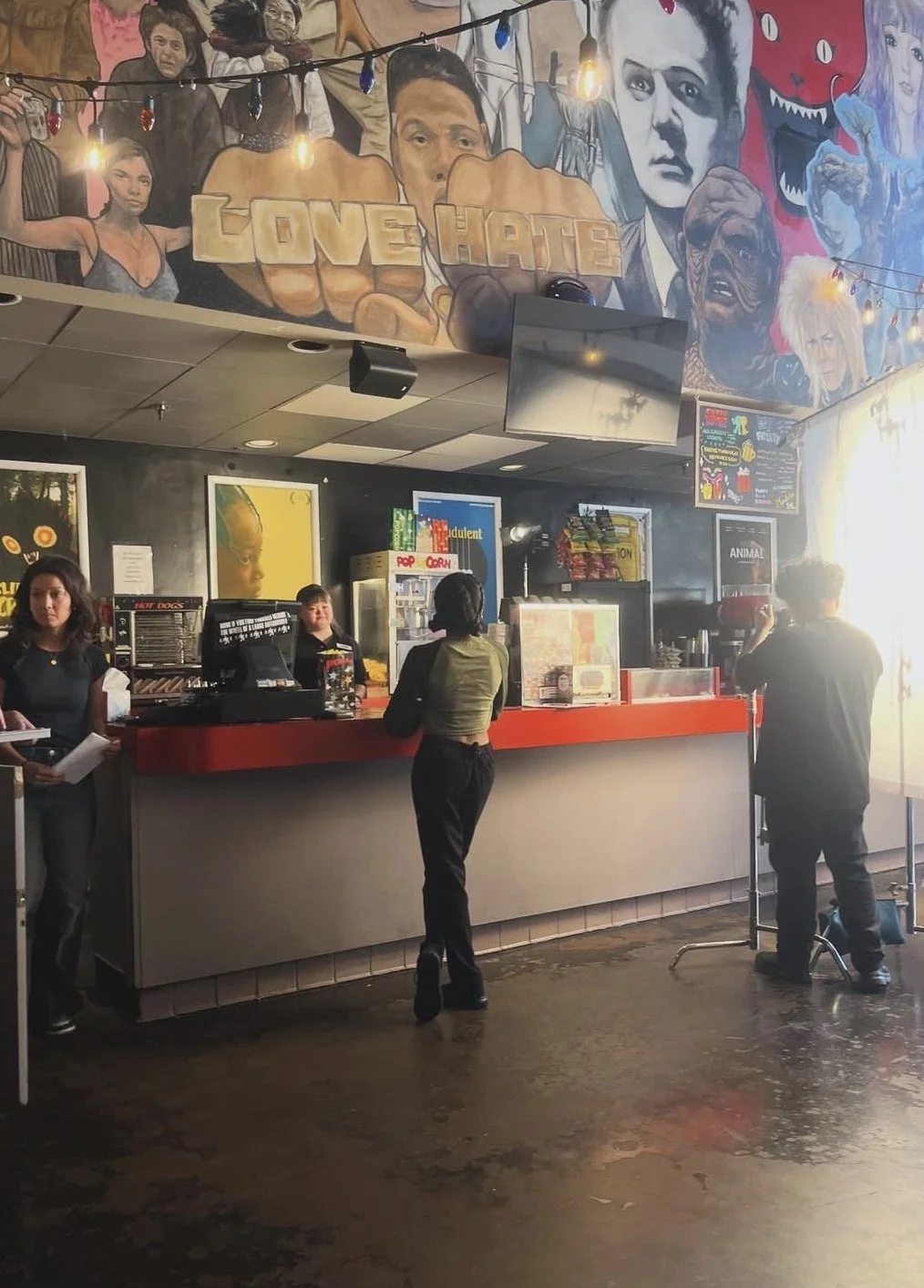
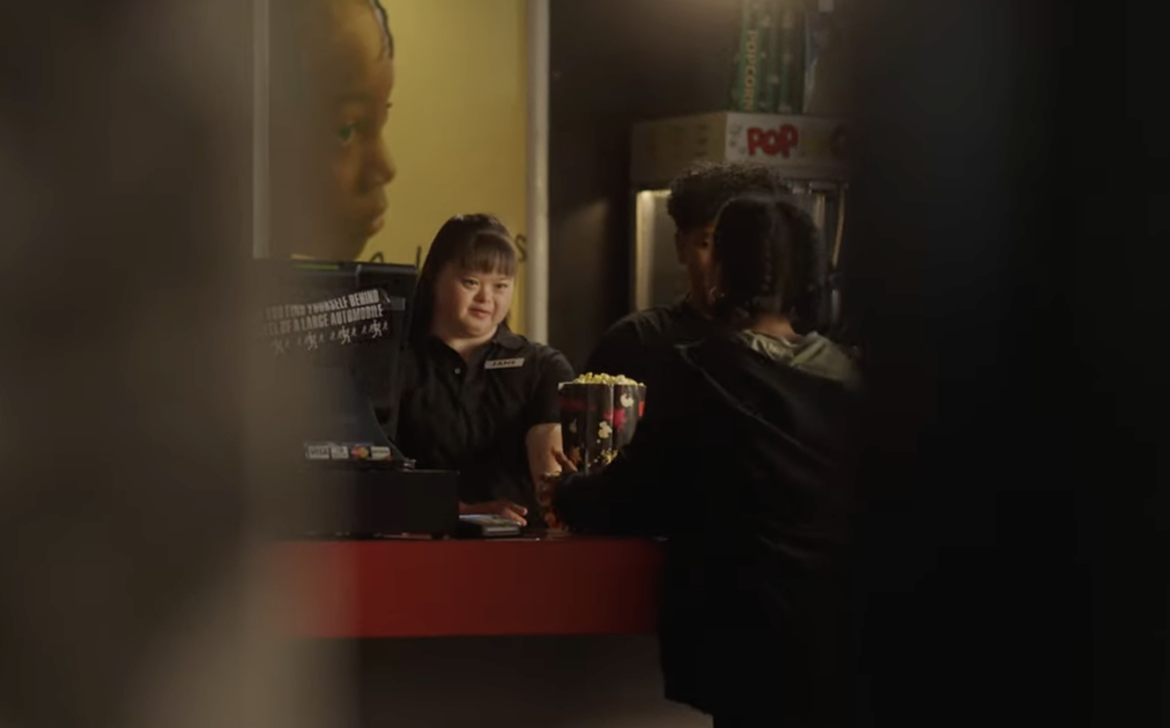
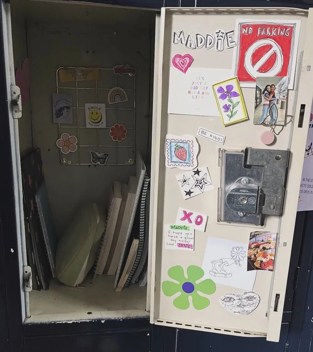
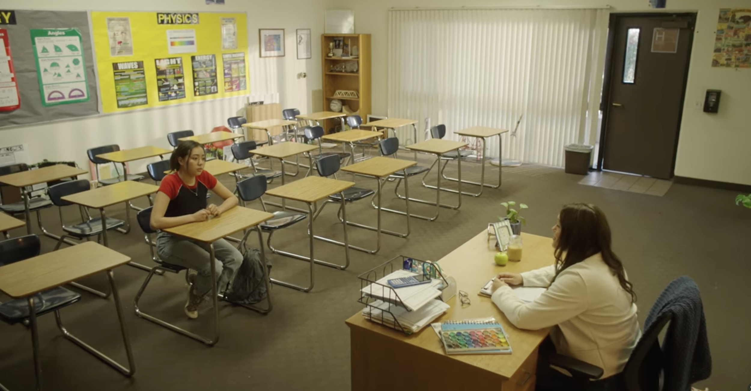
Buttered Noodles is an 11-minute character-driven short film about family, independence, and the evolving relationship between two sisters. The story follows Jane, a young woman with Down syndrome who is excited to begin her first job, and her younger sister Madeline, who has spent most of her life protecting and advocating for her. When Jane is given the opportunity to work at a local movie theater, Madeline struggles to accept that her sister is ready to take a step toward independence.
As Madeline secretly follows Jane to her new job, she is forced to confront her own fears about letting go and redefining what it means to support someone you love.
As Art Director, I helped shape the film's visual world by creating environments that felt warm, lived-in, and emotionally grounded. Because the story focuses heavily on family relationships and personal growth, the visual design emphasized everyday spaces that reflect comfort, familiarity, and gradual change.
Design Goals and Concept
The visual approach for Buttered Noodles centered on domestic warmth and everyday realism. The environments needed to feel authentic to both a middle-class family home and a small local theater, while keeping the characters’ emotional journey the focus of the story.
The film moves through several primary locations: the Meeker family kitchen, school hallways and lockers, and a local movie theater where Jane begins her first job. Each space reflects a different stage in Jane’s growing independence.
Key design priorities included:
Creating a warm, lived-in family kitchen that communicates routine, comfort, and family dynamics
Designing school environments that feel grounded and familiar to the teenage characters
Transforming a welcoming small-town theater environment that visually supports Jane’s first step into the working world
Maintaining visual continuity across locations so the story flows naturally between home, school, and work
The goal was to make the environments feel natural and supportive of the story without overwhelming the characters' emotional performances.
Responsibilities as Art Director
As Art Director, I worked closely with the production designer and director to oversee the physical environments and ensure visual cohesion across all locations.
My responsibilities included:
Supervising set dressing and prop placement in the family kitchen, school locations, and theater spaces
Coordinating visual continuity between the home, school, and workplace environments
Preparing and organizing key props used throughout the film, including kitchen cooking materials, household items, school lockers, and theater equipment
Helping design the visual identity of the movie theater environment where Jane begins working
Ensuring that environments felt authentic, lived-in, and appropriate for the characters’ world
Supporting art department logistics during location setup and resets between takes
Because the film relies heavily on naturalistic performances and emotional dialogue, the art department focused on subtle design choices that support the story while maintaining a grounded, believable environment.
Final Result
The final film presents a warm and intimate story about family, growth, and learning to support loved ones in new ways. The everyday environments—from the bustling family kitchen to the movie theater where Jane takes her first steps toward independence—anchor the characters' emotional journey.
Working as Art Director on Buttered Noodles involved creating a cohesive visual world that reflects the film’s themes of trust, independence, and changing family dynamics.
Below are location scouting photos, prop preparation, production stills, and behind-the-scenes images documenting the art department’s work throughout the production.
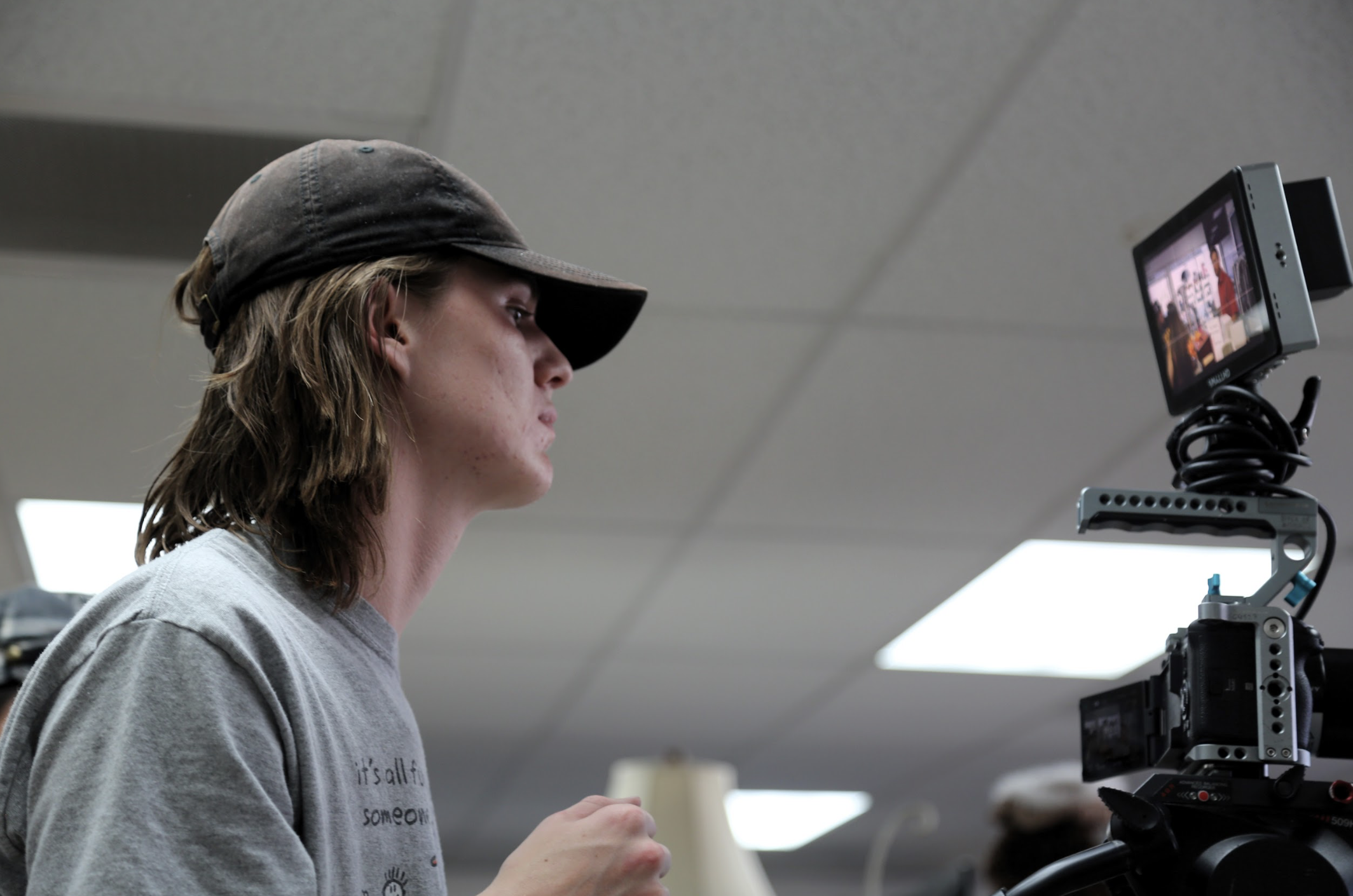
Museum of the Weird — “Faces”
Biola University - 11-Minute Short Episode
Role: Art Director
Project Overview
Museum of the Weird: Faces is an 11-minute horror short centered on two sisters left home alone for the night while their parents attend a formal dinner. What begins as an ordinary evening—watching TV and eating ice cream—quickly escalates into terror when an emergency broadcast warns of intruders in the area. As the night progresses, the girls begin noticing strange, ghostly faces staring through their windows, eventually realizing that something far more sinister may already be inside the house.
As Art Director, I worked closely with the production designer and director to shape the episode's visual world—transforming an ordinary suburban home into a tense, claustrophobic environment, where subtle design choices build suspense and unease.
Design Goals & Concept
The visual design of Faces relied on the contrast between familiar domestic comfort and growing intrusion. The house needed to feel safe, lived-in, and normal at the beginning of the film so that the gradual presence of the supernatural figures would feel increasingly disturbing as the story progressed.
Because most of the episode takes place in a single home at night, the art direction focused heavily on environmental control—especially around windows, lighting, and spatial layout.
Key design priorities included:
Creating a believable suburban family home through kitchen, living room, and entryway set dressing
Using windows, curtains, and blinds as major visual elements separating safety from the outside threat
Designing subtle environmental details that support tension without distracting from performances
Gradually shifting the tone of the space from comfortable to vulnerable as the story progresses
The presence of the mysterious faces becomes more unsettling because the interior environment feels so ordinary and familiar.
Responsibilities as Art Director
As Art Director, I oversaw the home's physical environment and coordinated the execution of the visual design throughout production.
My responsibilities included:
Supervising set dressing and prop placement across the kitchen, living room, and entryway locations
Coordinating visual continuity between scenes that take place throughout the night
Designing and preparing key props used in the home environment, including dinner settings, living room objects, and handheld items used during the suspense sequences
Overseeing the preparation and placement of windows, curtains, and blinds that play a central role in the film’s tension
Assisting with the preparation and application of prosthetic face pieces used for the intruders seen outside the windows
Helping coordinate how the prosthetic faces interacted with lighting and camera framing to maintain their eerie, featureless look
Working with the art department to ensure the set supported blocking and camera framing for suspenseful moments
Maintaining a natural, lived-in feel for the home while adjusting environmental details to increase tension in later scenes
Because the story relies heavily on subtle visual shifts—such as curtains opening or figures appearing outside windows—the art department had to maintain careful control over every detail of the environmen
Final Result
The final episode uses a simple domestic setting to build a slow sense of dread. Through controlled art direction and careful environmental design, the house transforms from a familiar family space into a vulnerable setting where the characters realize they may no longer be alone.
The addition of practical prosthetic faces helped create a disturbing visual motif that made the figures on the outside feel unnatural and unsettling, without relying on heavy digital effects.
Working as Art Director on Faces involved shaping both the environment and practical elements that allowed the suspense to unfold—supporting the horror through intentional set dressing, prop design, and practical effects.
Below are location scouting photos, prosthetic preparation, set dressing references, production stills, and behind-the-scenes images documenting the art department’s work throughout the production.

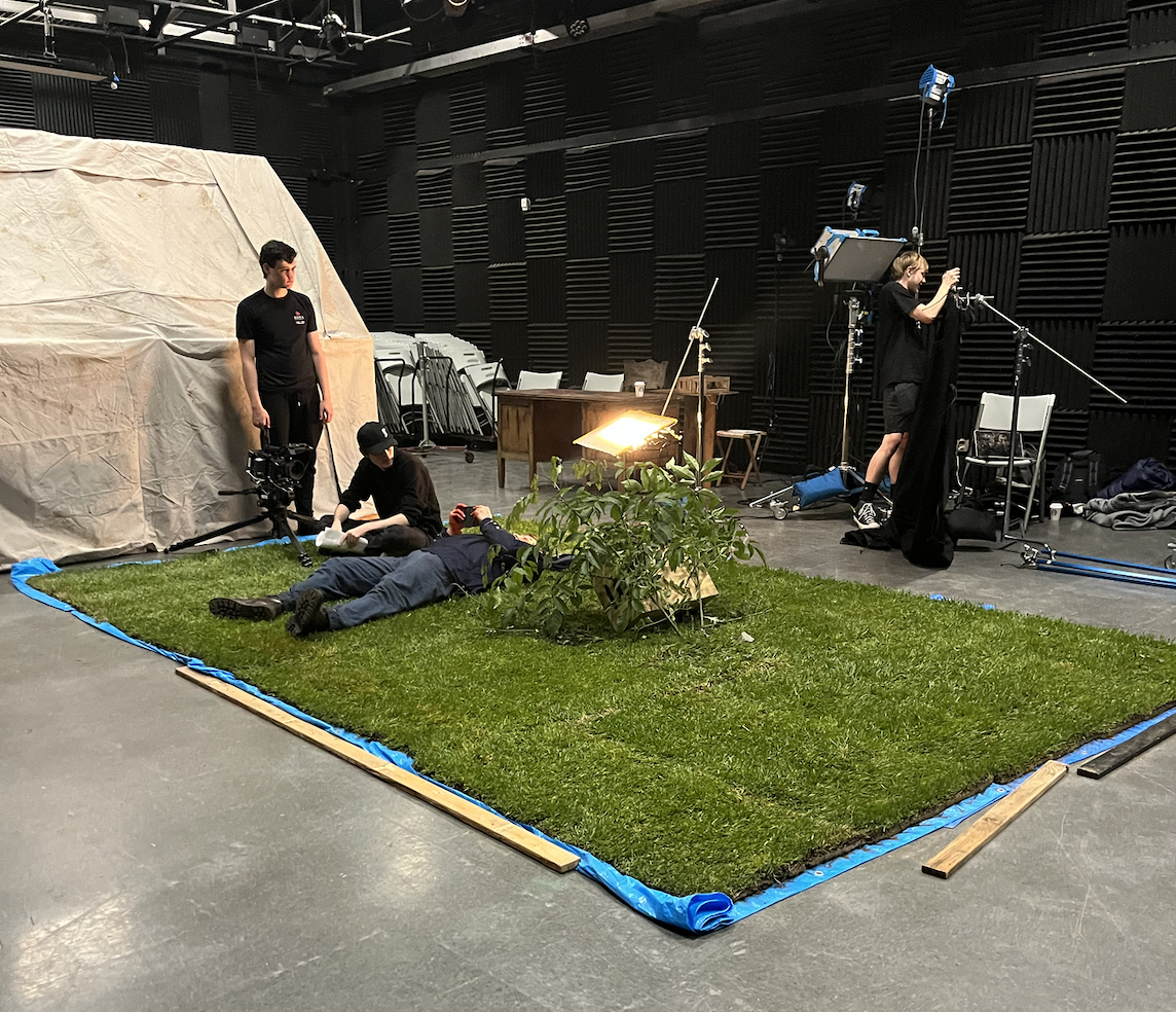
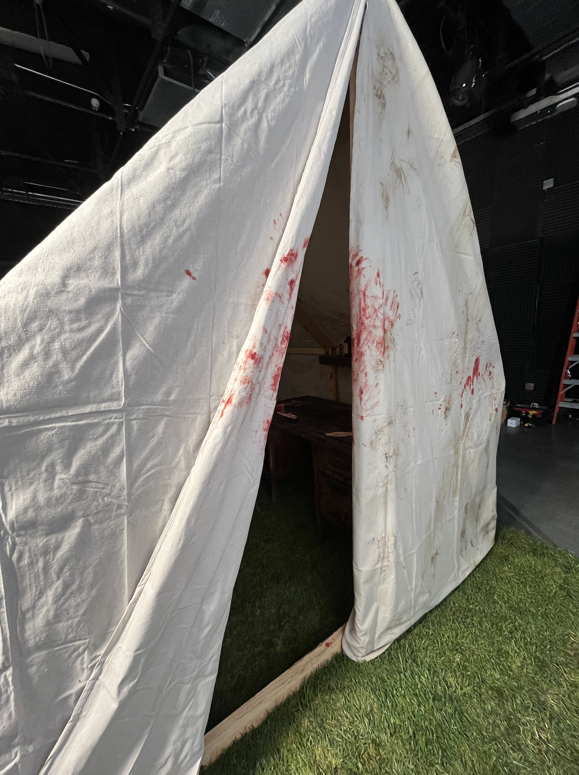
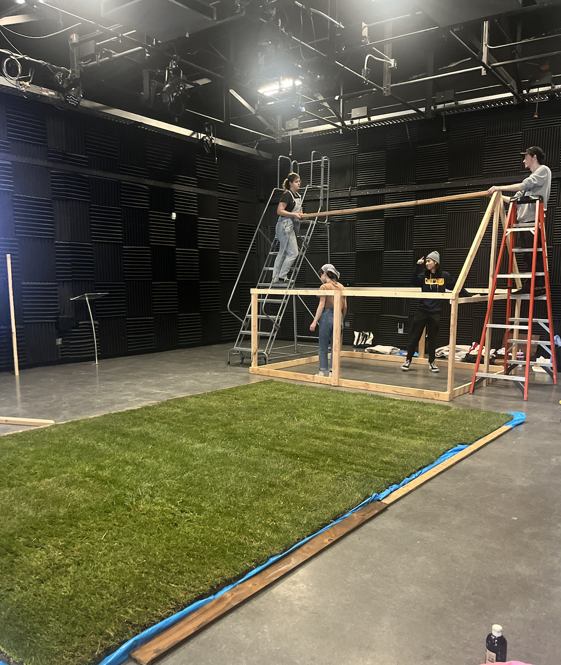
The Fields Are Burning
Biola University - 22-Minute Short Film
Role: Art Production Assistant
Project Overview
The Fields Are Burning is a 22-minute Civil War–era short film that follows two soldiers from opposing sides whose lives unexpectedly intertwine after a devastating battle. The story centers on Joe Graves, an aging Union soldier who survives a brutal battlefield with fatal wounds, and Gabriel Cobb, a young Confederate soldier who initially hunts him down before becoming an uneasy companion on Joe’s final journey.
As the two travel across battle-scarred landscapes, plains, and wildflower fields, their hostility gradually transforms into reluctant understanding. The story ultimately becomes a meditation on war, guilt, faith, and redemption, culminating in a tragic yet reflective ending.
As an Art Production Assistant, I supported the art department in building the film’s Civil War world—helping create historically grounded environments, preparing props, and assisting with practical effects that brought the battlefield and its aftermath to life.
Design Goals & Concept
The visual design of The Fields Are Burning contrasts the destruction of war with the quiet beauty of nature.
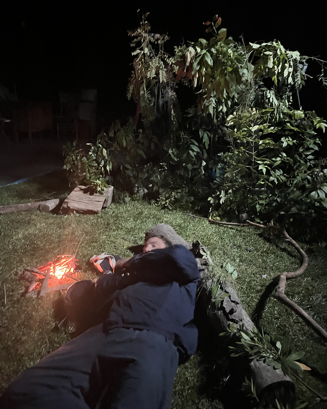
The early portions of the film emphasize chaos: smoke-filled battlefields, blood-stained uniforms, broken weapons, and the remnants of a violent clash between Union and Confederate soldiers. As the story progresses and the characters move farther from the battlefield, the environment transitions into open plains, tall grasses, and expansive wildflower fields.
This visual shift mirrors the emotional arc of the story—moving from violence and survival toward reflection, guilt, and the search for peace.
Key visual priorities included:
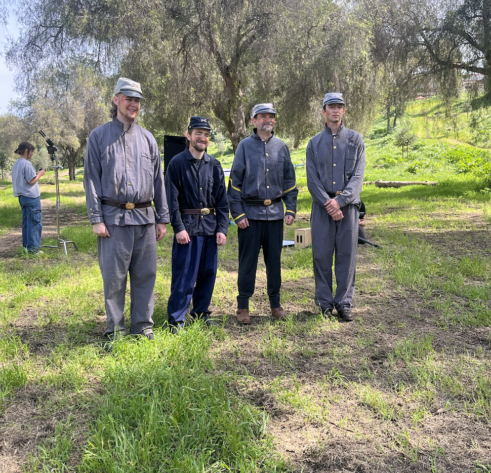
Creating a believable Civil War battlefield through distressed costumes, weapons, and environmental dressing
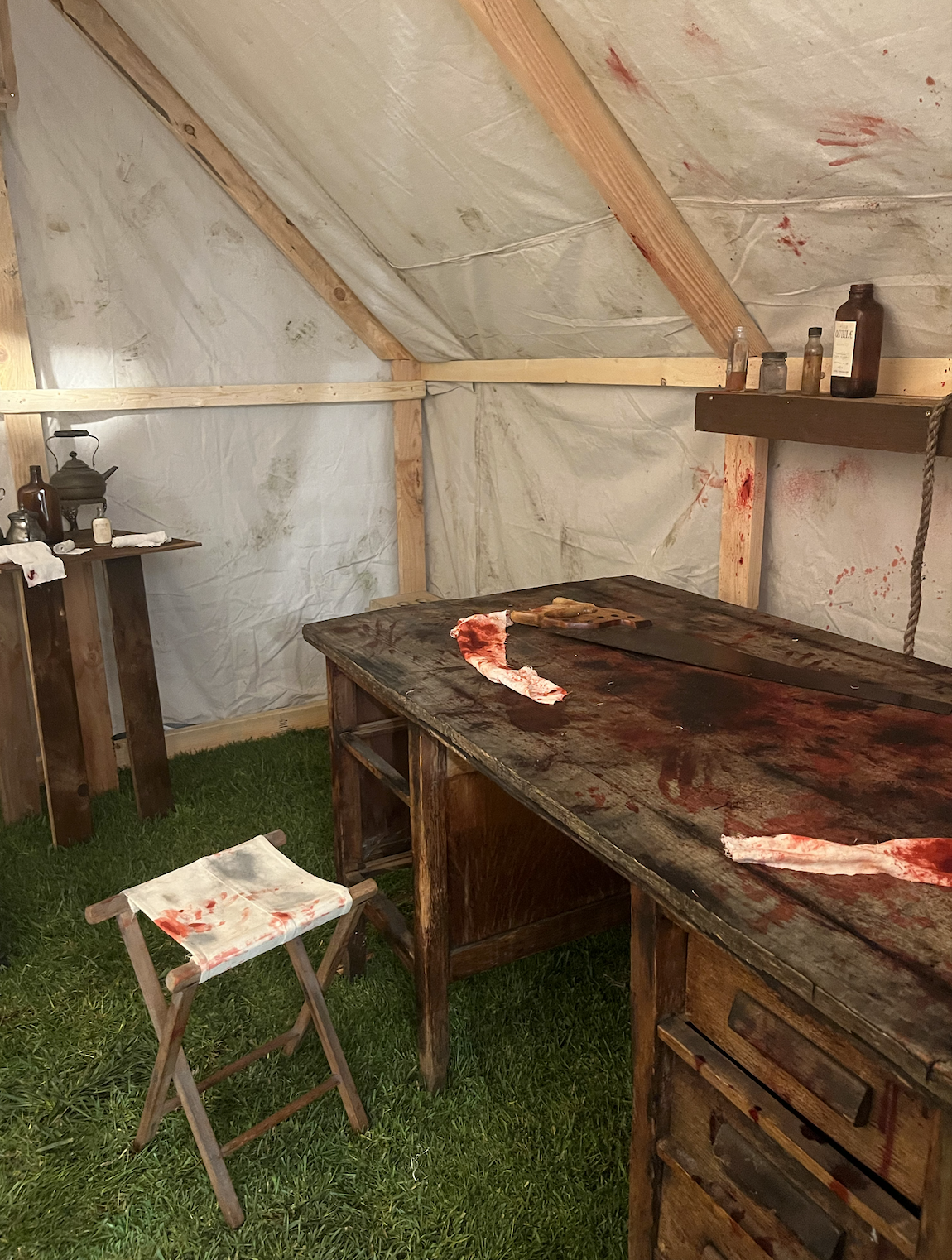
Designing historically inspired spaces, such as field camps and a wartime medical tent
Using practical effects to portray battlefield violence in a grounded, realistic way
Allowing the surrounding landscape—rolling plains, hills, and flowers—to contrast the brutality of the war
The goal was to keep the world tactile and grounded so that the emotional story between the two soldiers felt authentic.
Responsibilities as Art Production Assistant
As an Art PA, I worked closely with the production designer and art department to support the creation of the film’s historical environments and practical effects.
My responsibilities included:
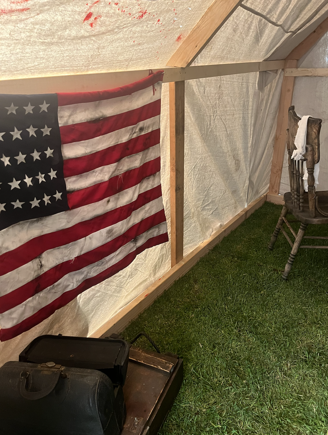
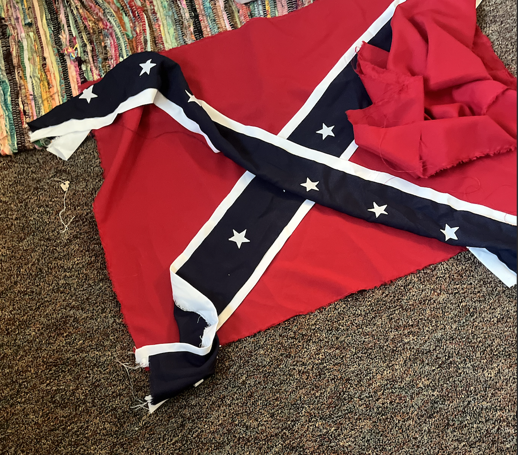
Hand sewing two historically styled flags used as environmental set dressing for battlefield scenes
Assisting in the construction and dressing of a Civil War–style field hospital tent, including medical tables, tools, and environmental distressing
Preparing and applying fake blood effects to props, costumes, and set pieces to simulate battlefield injuries
Assisting with practical effects for a gunshot head wound, helping coordinate the setup used to create the on-camera impact effect safely and convincingly
Helping age and distress props, fabrics, and equipment to reflect battlefield wear and damage
Assisting with battlefield prop setup, including weapons, gear, and environmental debris
Supporting art department resets between takes to maintain visual continuity
Assisting with set dressing and logistics during multiple outdoor location shoots
Because the production relied heavily on practical effects and physical environments, the art department played a major role in shaping the film's realism.
Final Result
The finished film blends historical realism with poetic visual storytelling. The destruction of the battlefield, the stark medical tent, and the blood-stained costumes ground the audience in the brutal reality of war, while the vast plains and fields of flowers create space for reflection and emotional weight.
Working on The Fields Are Burning as an Art Production Assistant provided hands-on experience with period design, practical effects, prop construction, and environmental storytelling, helping translate historical research and design concepts into a tangible on-set world.
Below are location scouting images, prop preparation, costume and flag construction, production stills, and behind-the-scenes photos documenting the art department’s work throughout the production.
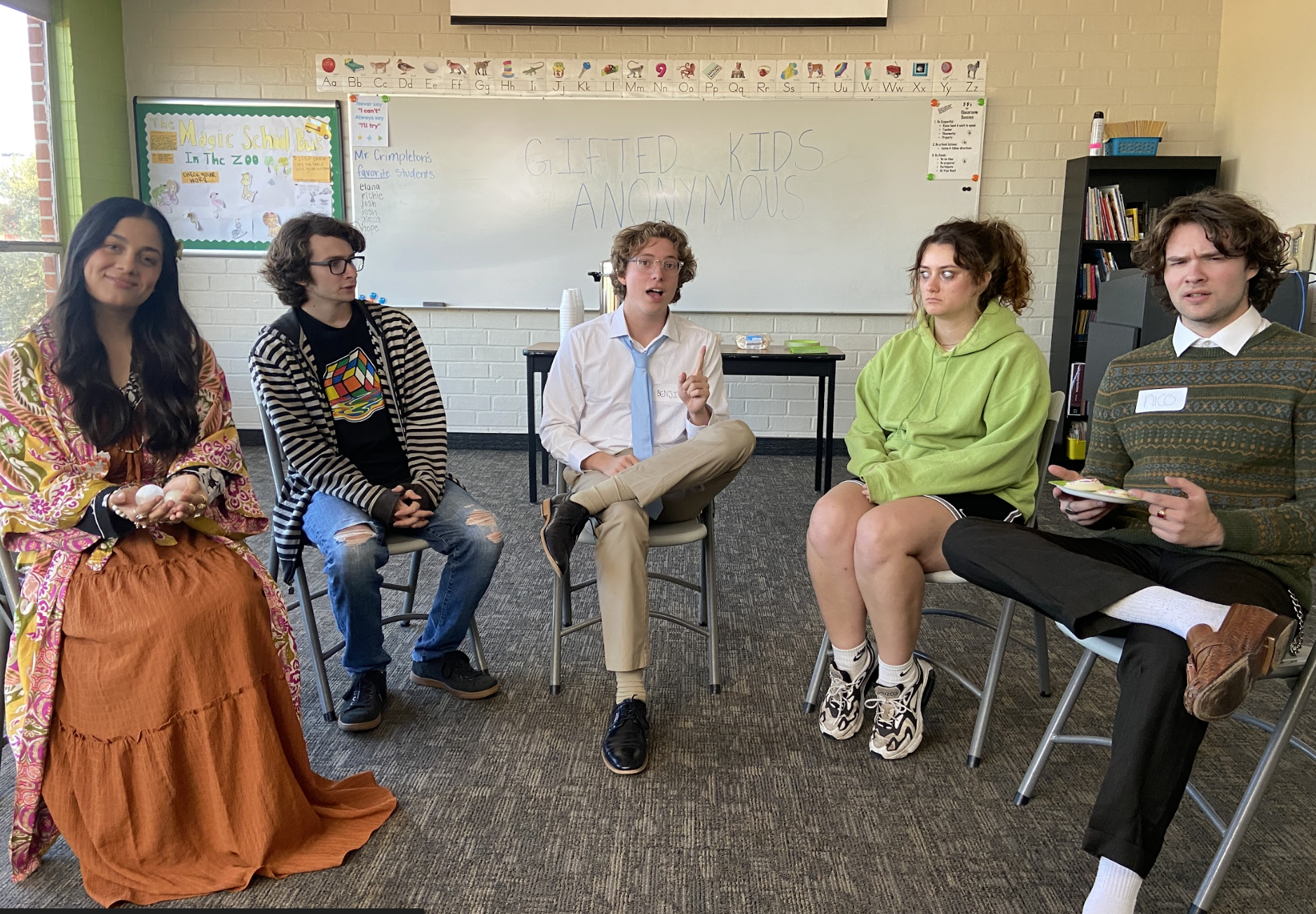
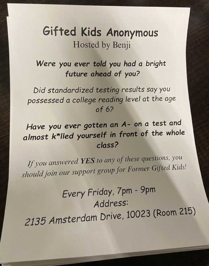
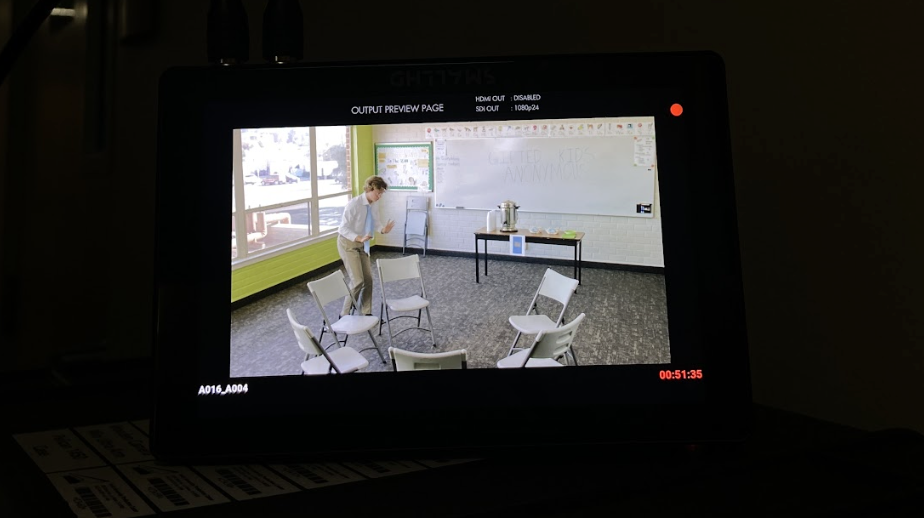
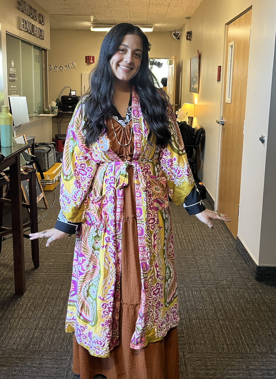
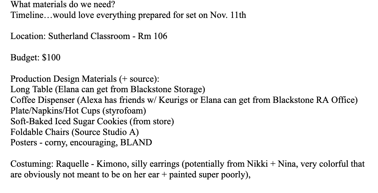
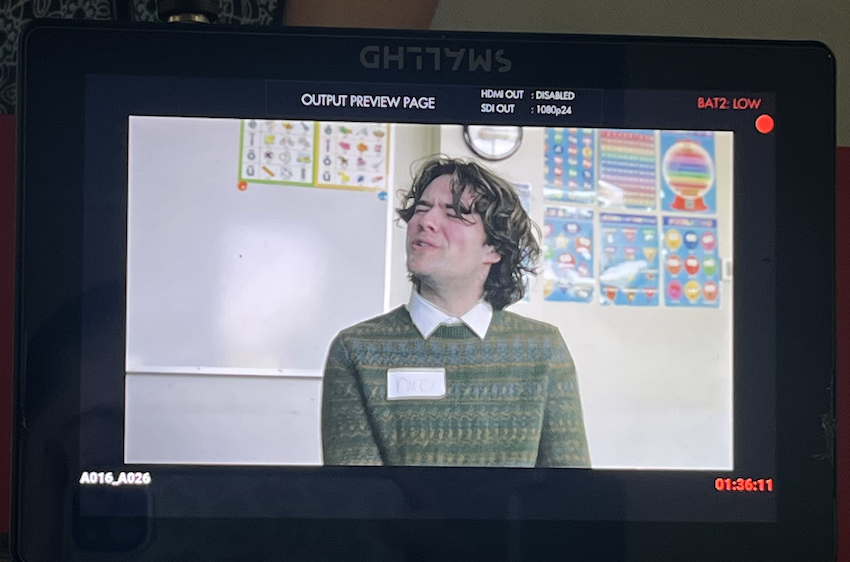
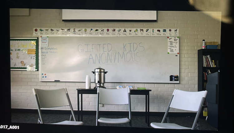
Gifted Kids Anonymous
Biola University - 8-Minute Short Film
Role: Production Designer and Costume Designer
Project Overview
Gifted Kids Anonymous is an 8-minute comedy set in a YMCA conference room, where a support group for “former gifted kids” quickly spirals into chaos. The story centers on Benji Crimpleton, an overly earnest group leader trying to facilitate healing, only to be derailed by a defiant Juilliard dropout and a spiritually optimistic painter facing a devastating medical diagnosis.
Though compact in length, the script moves rapidly from awkward sincerity to full-scale empowerment chants within a single scene. As both Production Designer and Costume Designer, my goal was to visually ground the comedy in realism while allowing character psychology to shape the world.
Design Goals and Concept
Because the entire short unfolds in one primary location—a YMCA conference room—the environment needed to carry narrative weight. The space was designed to feel authentic, underfunded, and painfully ordinary: fluorescent lighting, metal folding chairs arranged in a “Circle of Truth,” a folding table with a coffee dispenser, and a plate of iced sugar cookies.
The visual humor relies on contrast: institutional blandness versus outsized personalities.
Key design intentions included:
Creating a tight circular layout that visually traps characters in confrontation
Using muted, institutional tones (beige, gray, soft green) to contrast expressive costumes
Selecting props that subtly reveal character delusion versus reality (crystals, cookies, handmade jewelry)
Maintaining grounded realism so escalating absurdity—standing on chairs, chanting declarations—feels heightened but believable
The room stays neutral. The characters unravel.
Responsibilities as Production and Costume Designer
In this dual role, I shaped both the physical world and the personal identities within it.
Production Design Responsibilities:
Developing the overall visual tone for a grounded, character-driven comedy
Designing and dressing the YMCA conference room to feel authentic and slightly neglected
Establishing environmental storytelling through specific props (coffee dispenser, cookie plate, folding chairs, signage)
Planning spatial blocking to support escalating tension within a confined setting
Creating contrast between imagined moments and fluorescent-lit reality
Maintaining visual continuity during rapid tonal shifts
Costume Design Responsibilities:
Costume design was essential in immediately communicating identity and arrested development.
Designing wardrobes that reflect each character’s self-perception versus reality
Using silhouette, texture, and color to signal ego, insecurity, and optimism
Reinforcing comedic archetypes while keeping characters emotionally grounded
Coordinating wardrobe choices to stand out against the neutral YMCA backdrop
As the script builds toward collective chanting and emotional escalation, the rigid institutional setting and carefully curated costumes amplify the comedy without overpowering it.
Final Result
The final visual language of Gifted Kids Anonymous transforms a modest conference room into a comedic pressure cooker. Through cohesive production design and intentional costume choices, the world feels believable enough to hold sincerity—yet restrained enough to let absurdity shine.
In just eight minutes, the design supports the script’s central tension: Are these characters confronting their former identities—or simply rebranding their giftedness in a new circle?
Below are location images, costume pulls and fitting photos, production stills, basic graphic design, and behind-the-scenes photos documenting the design process from pre-production through shoot day.